Neoclassical business center facade
Photo by Florstein (Telegram:WikiPhoto.Space)

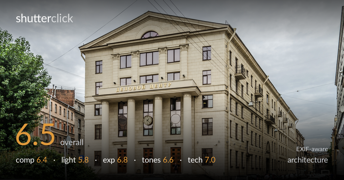
| Focal length | 18 mm |
| Aperture | f / 8.0 |
| Shutter | 1/200 s |
| ISO | ISO 100 |
| Exp. comp. | 0.0 EV |
| Shot at | 13:30 · Jul 26, 2012 |
A solid, informative record of a neoclassical business center, well served by a three-quarter angle that shows both the pedimented portico and the long side elevation receding into the street. What most holds it back is the overhead power lines slicing across the pediment and sky, and the flat, overcast light that drains the facade of relief and shadow. The foreground row of parked cars competes for attention with the architecture. The verticals are largely controlled and the building is rendered cleanly, but the soft grey sky and tangle of wires keep this from rising above a competent documentary frame.
The three-quarter angle is a sound choice, presenting the columned portico frontally while letting the side wing draw the eye down the street with strong perspective. The building sits high and confident in the frame. Working against it: the diagonal power lines cut directly across the pediment and dominate the upper sky, and the foreground is cluttered with parked cars that add little. The tree on the left frames usefully but encroaches. A position that hid or minimised the wires, and less foreground asphalt, would tighten the read considerably.
Flat, even overcast light covers the scene with no directional modelling. For a facade this richly articulated — columns, pediment, recessed window bays — raking side light would carve out the depth and relief that gives such architecture its drama. As shot, the stone reads uniformly pale and the column cylinders lack the shading that conveys their roundness. The diffuse light does keep highlights and shadows manageable and detail consistent across the whole structure, but the result is descriptive rather than expressive. Early or late side light would transform this.
Exposure is well judged for the conditions. The pale stone facade holds detail without blowing out, and the shadowed recesses under the portico and in the doorways retain readable information. The bright overcast sky is near the top of the range but not badly clipped. The histogram sits where it should for a high-key grey day. Midtones on the masonry are placed cleanly. Nothing here looks accidental — the f/8 base-ISO choice gives a clean, evenly exposed frame with good latitude preserved throughout.
White balance is neutral and believable, the cream stone reading accurately against the cool grey sky. The tonal range is inevitably compressed by the flat light, leaving the image low in contrast and somewhat muted overall. The red car provides the one strong colour accent, perhaps too strong against the restrained palette. The sky is a featureless grey that adds little. A modest contrast lift and some local dodging on the facade would give the masonry more presence without looking forced.
The settings are well chosen for the task. At 18mm the wide field captures the full facade and the receding side elevation, though this focal length introduces the perspective stretching visible toward the frame edges. f/8 is the sweet spot for this lens, delivering front-to-back sharpness across a subject that demands deep focus, and base ISO 100 keeps the file clean with no visible noise. 1/200s is more than adequate handheld at this focal length and freezes the few moving figures cleanly. Focus is accurate across the building. The verticals on the central portico are largely upright, suggesting careful camera leveling or correction, though the side wing shows some natural convergence from the angle. The main technical weakness is not the gear but the wide-angle distortion at the edges and the keystoning that a tilt-shift lens or perspective correction in post would resolve. For a single-frame architectural capture, the execution is sound and the file is clean.
What would elevate it
Tags
Shot something like this?
Expert photo critique, on demand — scored across six categories, EXIF-aware. Start with 3 free critiques, no credit card.
critique my photo — free