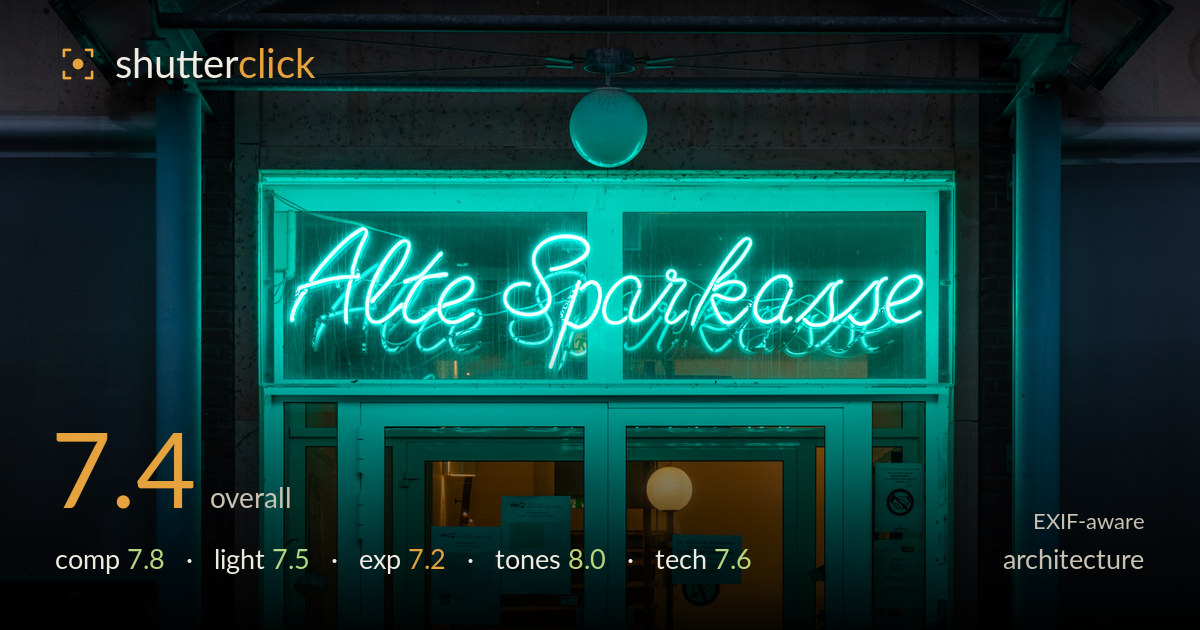
Neon glow at the old bank entrance
Photo by Dietmar Rabich

| Focal length | 46 mm |
| Aperture | f / 8.0 |
| Shutter | 1/100 s |
| ISO | ISO 200 |
| Exp. comp. | -3.67 EV |
| Shot at | 06:56 · Feb 5, 2021 |
A confident, symmetrical night portrait of an entrance that leverages the neon-cyan wash against the warm interior glow to real effect. The frontal, centred framing suits the subject and the arched canopy gives the composition a satisfying cap. The colour contrast between cool teal and interior amber is the image's strongest asset and carries the mood. What most holds it back is the slightly loose framing at bottom, where the foreground pavement sits in near-total shadow and adds dead weight, and a faint vertical tilt. Cleaner verticals and a tighter base crop would sharpen the whole.
The dead-centre, symmetrical approach is the right call for this frontal subject, and the arched canopy caps the frame nicely while the paired doors and columns give balanced weight. The bollard aligns with the door split, reinforcing the axis. Less successful is the lower third: the dark brick steps and pavement occupy a large, low-detail area that pulls energy downward without reward. A tighter crop from the bottom or a slightly higher vantage would lift the neon sign and glowing doorway toward stronger placement in the frame.
The mixed-light situation is handled with awareness — the cyan neon spills across the concrete and glass while the warm interior lamp and stairwell provide a counterpoint of amber deep in the doorway. That temperature contrast is what makes the shot work, drawing the eye through the glass. The neon itself is intense enough to bloom slightly on the transom glass, which reads as authentic rather than sloppy. The surrounding facade falls into flat, even shade with little modelling, so the drama lives entirely in the doorway.
The heavy -3.67 EV compensation is a deliberate choice to protect the neon and interior highlights, and it largely succeeds — the bright tubing holds shape rather than clipping to white. The trade-off is the foreground pavement and lower brick, which sink into near-black with almost no recoverable detail. That works as a framing device but leaves the bottom third dead. The interior amber retains legible detail on the stairs and posters, which is the important zone. A touch more shadow lift would add depth without hurting the highlights.
The teal-versus-amber palette is the image's signature and it is well managed — the neon cyan reads clean and saturated without turning garish, and the warm interior provides genuine complementary contrast. White balance sits cool overall, which suits the night mood and lets the doorway glow read as inviting. Tonal separation between the lit sign, the glass reflections, and the shadowed brick is handled with restraint. Blacks are deep and hold without crushing colour into muddiness. This is the strongest category of the frame.
The settings are well chosen for a static night architecture subject. f/8 on the 24-105 at 46mm keeps the whole facade and doorway sharp front to back, which is exactly what this frontal composition needs, and it sits in the lens's sweet spot for corner-to-corner resolution. ISO 200 keeps noise negligible in the shadow areas, important given how dark the lower frame runs. At 1/100s handheld the frame appears steady with no visible shake, though a tripod would have permitted a lower ISO and a longer exposure to lift shadow detail cleanly rather than relying on the heavy negative compensation. Focus is accurate on the sign and door plane. The main technical caveat is a faint vertical lean — the columns and door frames are not quite plumb, which a level or in-post correction would resolve. For architecture, that keystoning discipline matters, and it is the one execution detail short of tidy here.
What would elevate it
Tags
Shot something like this?
Expert photo critique, on demand — scored across six categories, EXIF-aware. Start with 3 free critiques, no credit card.
critique my photo — free