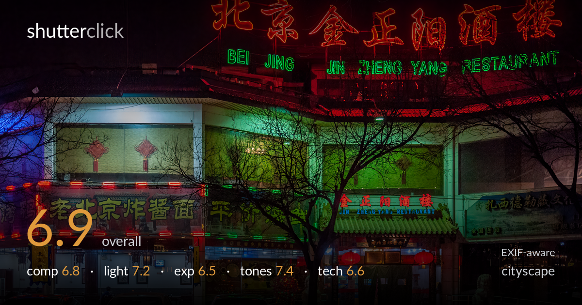
Neon-lit restaurant at night
Photo by Ermell

| Focal length | 20 mm |
| Aperture | f / 1.7 |
| Shutter | 1/100 s |
| ISO | ISO 400 |
| Exp. comp. | 0.0 EV |
| Shot at | 20:57 · Jan 2, 2011 |
A richly atmospheric night facade where competing neon — red, green, blue — does the heavy lifting and gives the frame real character. The bare tree silhouetted against the green-lit entrance is the strongest compositional element, anchoring the centre. What holds the image back is the foreground: a row of parked cars cuts a dark, cluttered band across the bottom third, pulling weight away from the storefront. The red signage at top is on the edge of clipping, and the overall framing is slightly loose. Tighter foreground management and exposure restraint on the brightest neon would sharpen an already evocative scene.
The frontal, symmetrical take on the facade suits the subject, and the silhouetted tree against the green entrance gives the centre a strong focal anchor. The neon banner across the top reads cleanly. The weakness is the foreground: the parked cars form a dark, busy band that competes with the storefront rather than supporting it, and their cropped edges at frame bottom feel accidental. A vantage that reduced the cars, or a tighter crop on the upper two-thirds, would let the architecture and signage carry the frame.
The light is entirely the subject here, and the mix of red, green and blue neon creates genuine depth and separation between the two storefronts. The green wash on the central entrance and the red glow up top read as distinct planes, which gives the flat facade dimension. Shadows fall naturally into the recessed areas. The trade-off inherent to neon is uneven intensity — the brightest reds dominate while the lower shopfronts sit dim — but the colour interplay is the image's biggest asset and is handled with a good eye.
Exposure is a reasonable compromise for a high-contrast night scene, holding detail across the mid-lit facade. The brightest red neon in the top sign is on the verge of clipping, losing the fine tube structure that would keep it crisp. Shadow areas — the foreground pavement and the dark car band — sit very deep with little recoverable detail. A slightly darker exposure, or bracketing for the signage, would have protected the saturated reds without much cost elsewhere, since the highlights are the limiting factor here.
The colour rendering is the standout: saturated neon reds and greens stay vivid without smearing into one another, and the white balance lets each light source keep its own cast rather than averaging to mud. Contrast is strong and appropriate for night, with deep blacks framing the glow. The greens carry a slightly heavy, almost murky quality in the central windows, but that reads as the actual light rather than a grading error. Overall a confident, characterful colour palette well suited to the scene.
Shooting wide open at f/1.7 on the 20mm is an aggressive choice for a facade that wants front-to-back sharpness — the depth of field is shallow, and while the central signage and tree hold, edges and the deeper interior softness suggest the plane of focus is doing a lot of work it shouldn't have to. Stopping down to f/4–f/5.6 would have sharpened the whole storefront, and at 1/100s with a static subject there was ample room to drop shutter speed or raise ISO modestly to compensate. ISO 400 keeps noise well controlled, a sensible call. The 20mm focal length frames the building naturally without heavy distortion, and verticals stay largely honest — good for cityscape. Focus appears placed around the tree and entrance, which works, but the wide aperture leaves the lower shopfront signage softer than ideal. A tripod would have unlocked f/8 and a longer exposure, the cleaner path to this kind of static night architecture.
what would elevate it
tags
Shot something like this?
Expert photo critique, on demand — scored across six categories, EXIF-aware. Start with 3 free critiques, no credit card.
critique my photo — free