Neon night in akihabara
Photo by sofi5t

No EXIF metadata in this file
Technical analysis based on visual assessment only.
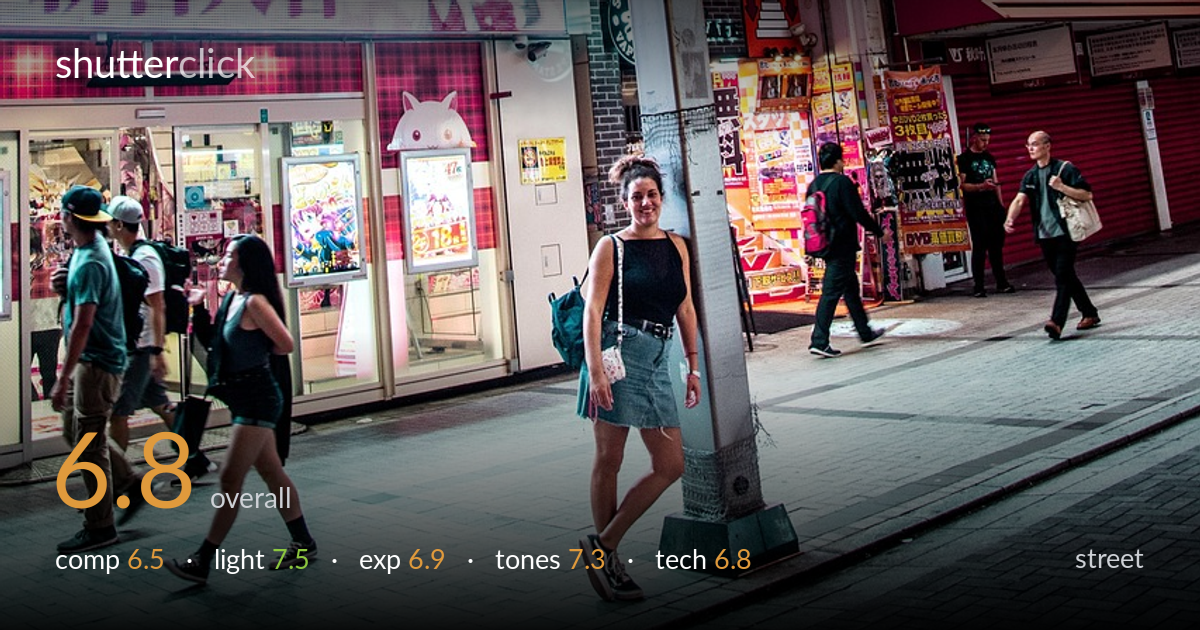
A dense, energetic slice of Akihabara at night, with the neon advertising wall doing most of the heavy lifting. The vertical orientation suits the towering signage and the saturated pinks and reds give the frame a strong sense of place. What holds it back is the relationship between the standing woman and the lamp pole that sprouts directly from her — that overlap is the central composition problem, leaving the human anchor feeling stuck rather than placed. The pole bisects the lower frame awkwardly. Strong atmosphere and colour, but the foreground subject placement needs resolving.
The towering bank of neon signs builds genuine depth and a convincing sense of place, and the eye moves up the frame readily. The trouble is the foreground: the central lamp pole grows straight out of the standing woman, merging subject and post into an awkward tangle. She sits dead-centre yet competes with the pole rather than owning the space. The moving figures on the left add life, but the bottom third feels cluttered. Offsetting the woman from the pole would clarify the human anchor immediately.
The scene is lit almost entirely by signage and storefront glow, and that mixed artificial light is the photo's greatest asset — pinks, reds and cool whites layer across the facade with real richness. The standing woman catches enough frontal spill to read clearly, separating her from the dim pavement. Highlights in the brightest signs push hot but hold their character. The light direction is uncontrollable here, yet the timing and exposure capture the saturated nighttime mood that defines this district. Atmospheric and convincingly of-the-place.
Exposure is well balanced for a difficult high-contrast night scene. The brightest signs — the white kanji panels up top and the illuminated MAX lettering — flirt with clipping but largely retain detail. Shadow areas on the pavement and the right-side figures stay readable without lifting into noise. The standing woman is exposed to show her face and clothing clearly against the darker ground. A touch more highlight restraint on the upper signage would protect the hottest whites, but overall the brightness decisions read as deliberate and controlled.
Colour is the engine of this image: the magenta and red signage saturates strongly without tipping fully into garish, and the white balance holds the neon palette believably warm. There's good tonal separation between the glowing facade and the cooler, darker street level. The reds dominate, which suits Akihabara, though the pinks occasionally blend into one another and flatten parts of the upper frame. Slightly pulling global saturation while protecting the skin tones would keep the energy and add a little tonal breathing room.
Sharpness is solid across the signage, and the standing woman is in acceptable focus, suggesting a steady hand or adequate shutter for a handheld night frame. Noise is well controlled given the low light, with clean shadows on the pavement and no obvious smearing from aggressive noise reduction. Depth of field is deep enough to keep both foreground figures and the towering background signs legible, which suits a street scene where context matters. The moving figures on the left show mild motion blur — appropriate and even welcome for conveying the bustle, though the shutter could have been a touch faster if a crisp freeze of the walkers was the goal. The lens choice handles the vertical compression of the tall facade well without obvious distortion. The main technical weakness is not gear but framing: the pole intersecting the subject is a placement issue rather than an execution fault. Focus and stability are otherwise dependable for the conditions.
what would elevate it
tags
Shot something like this?
Expert photo critique, on demand — scored across six categories, EXIF-aware. Start with 3 free critiques, no credit card.
critique my photo — free