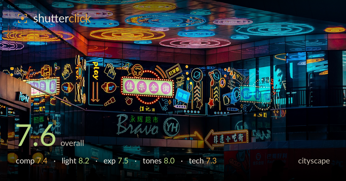
Neon signs above a night crowd
Photo by deranho

No EXIF metadata in this file
Technical analysis based on visual assessment only.
A dense, energetic slice of neon nightlife that trades in colour and layering rather than a single hero element. The luminous ceiling of concentric rings anchors the top third and pulls the eye upward, while the silhouetted crowd at street level grounds the scene and adds human scale. The strength here is the sheer saturated variety of signage held together by a coherent teal-and-amber palette. What holds it back is the lack of a clear focal hierarchy — the eye ricochets across competing signs with no single resting point — and a slightly busy lower edge where silhouettes crowd together. A cleaner compositional spine would elevate the whole.
The frame layers three tiers well: the glowing ceiling of concentric rings, the wall of signage, and the silhouetted crowd below. That vertical stacking creates depth and reads as a proper cityscape. The central pink sign roughly holds the middle, but the composition lacks a dominant anchor, so attention scatters across many competing signs. The silhouettes along the bottom edge are a touch cramped and evenly distributed, weakening the base. A stronger diagonal or a single figure given breathing room would give the eye somewhere to land.
The neon is the whole show and it delivers — a rich mix of hard artificial point sources against deep shadow, exactly what this genre wants after dark. The overhead ring installation is the standout, its glow spilling onto the polished ceiling and adding a reflective sheen. Colour temperature contrast between cool teal and warm amber gives the scene dimension and separates the tiers. The silhouetted foreground figures, lit only by rim spill, are handled cleanly and preserve the mood rather than fighting it.
Exposure is judged well for a high-contrast night scene: the bright signage retains colour and mostly avoids blown cores, while the crowd sits in intentional silhouette rather than muddy underexposure. A few of the brightest amber and white elements clip slightly, which is hard to avoid with this many light sources. Shadow areas hold enough structure to keep the architecture legible without lifting into noise. The overall balance protects the neon saturation, which is the right priority here. Watch the hottest sign cores on a reshoot.
The teal-and-amber palette is the tonal backbone and it's cohesive, giving an otherwise chaotic wall of signs a unifying scheme. Saturation is pushed but stays believable rather than garish, and white balance sensibly refuses to neutralise the coloured light. Contrast is strong, with inky blacks in the silhouettes setting off the glowing hues. The magenta of the central sign adds a welcome third note. Mid-tone gradation in the darker glass surfaces is a little compressed, but the overall grade suits the subject.
From the visual evidence this is a competent handheld or tripod night capture. The signage detail is crisp where it counts — text on the central signs and the ceiling rings resolve cleanly, suggesting accurate focus on the mid-plane and a shutter fast enough to keep static elements sharp. Noise is well controlled in the shadows, which points to a sensible ISO and clean processing. Depth of field appears deep enough to hold both the ceiling and the storefronts, appropriate for this layered scene. The foreground silhouettes are motion-free, so either the crowd was fairly still or the exposure was short. The main technical limitation is the slight clipping in the hottest sign cores, where highlight recovery has reached its limit. A marginally lower exposure with the brights protected, or a bracketed blend, would retain more texture in those glowing elements without sacrificing the shadow mood. Overall execution is solid and clean.
What would elevate it
Tags
Shot something like this?
Expert photo critique, on demand — scored across six categories, EXIF-aware. Start with 3 free critiques, no credit card.
critique my photo — free