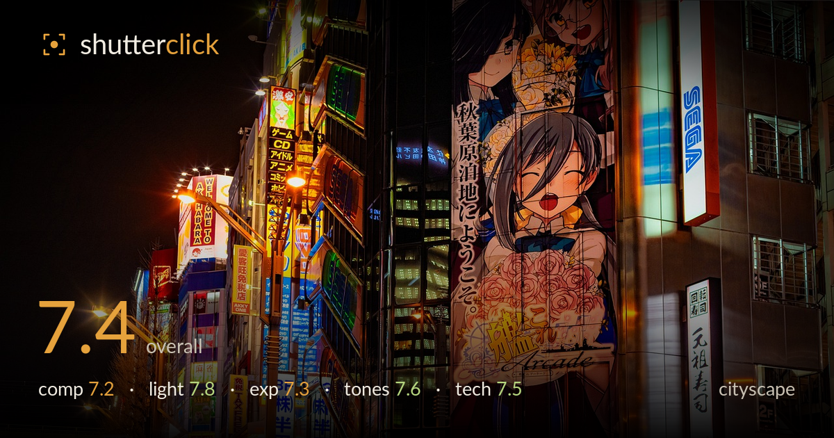
Neon signs of akihabara at night
Photo by djedj

No EXIF metadata in this file
Technical analysis based on visual assessment only.
A dense, saturated slice of Akihabara at night that captures the neon chaos this district is known for. The layered signage receding down the left corridor gives real depth, and the SEGA branding and large anime billboard anchor the frame with recognizable, atmospheric detail. What most holds it back is the lack of a single organizing subject — the eye ricochets between competing bright elements without a clear resting point. The dark, empty sky occupies a large chunk of the upper frame without contributing much. A stronger compositional priority and a touch more restraint in the saturation would lift this from a good record of place to a memorable image.
The left-to-right recession of signage down the street creates genuine depth and pulls the eye into the frame, which is the strongest structural choice here. The corner building splits the composition into a busy left and a large-graphic right, giving two zones of interest. The trade-off is a lack of clear hierarchy — no single element commands attention, and the eye wanders. The upper-right dark sky and the plain building faces on the far right sit heavier and emptier than the rest, slightly unbalancing the density that defines the lower two-thirds.
The mixed artificial light is the heart of this image and it is handled well — warm sodium street lamps play against cool neon blues and the saturated reds of the SEGA signage, giving the scene its characteristic electric energy. The light sources are numerous and evenly distributed enough to keep the frame alive throughout. The illuminated billboard provides a large, soft light mass that balances the pinpoint neon. The main limitation is that with so many competing light sources, none dominates to shape a focal point.
Exposure is well judged for a high-dynamic-range night scene. The brightest signage — the white SEGA panels and the lit billboard — holds together without blowing out to featureless white, which is the hardest thing to protect here. Shadow areas in the sky and lower street retain enough separation to read as depth rather than dead black. A few of the most intense neon tubes edge toward clipping, but that reads as intentional rather than accidental. Overall a controlled, deliberate exposure.
The colour palette is the image's signature — deep reds, electric blues, and warm ambers layered densely across the frame. White balance sits warm, appropriate for the sodium-and-neon environment. Contrast is strong, giving the scene punch. That said, the saturation is pushed to the point where some of the reds and oranges begin to feel heavy and slightly plasticky, flattening subtle tonal transitions in the signage. A modest pullback would restore some breathing room and let the individual hues read more cleanly.
Sharpness holds well across the frame, with the signage text and the billboard artwork rendering crisply — evidence of a stable capture, likely tripod-supported or braced given the low light. Depth of field appears deep enough to keep both near and far signage acceptably sharp, appropriate for a cityscape where the whole scene is the subject. Noise is well controlled in the mid-tones and only becomes noticeable in the darker sky and shadow patches, which is respectable for a night exposure. Focus is accurate on the mid-ground signage. The main technical observation is that the frame's edges, particularly the far right building, show slightly softer rendering and less compelling detail than the center, suggesting the composition could have been tightened or the lens's stronger central zone used more deliberately. Overall the execution is clean and the difficult mixed-light exposure has been managed with skill — the technical foundation is solid and supports the busy scene without distraction.
What would elevate it
Tags
Shot something like this?
Expert photo critique, on demand — scored across six categories, EXIF-aware. Start with 3 free critiques, no credit card.
critique my photo — free