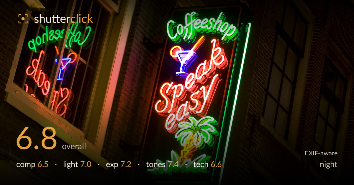
Neon speakeasy sign at night
Photo by Massimo Catarinella

| Focal length | 40 mm |
| Aperture | f / 9.0 |
| Shutter | 3/10 s |
| ISO | ISO 100 |
| Exp. comp. | -1.33 EV |
| Shot at | 21:05 · Sep 26, 2008 |
A vibrant neon sign shot that leans on saturated colour and a clever reflection to carry the frame. The projecting "Speak Easy" sign is the clear anchor, and its self-emitted light reads cleanly against the dark brick without significant clipping. The mirrored sign in the window adds a nice secondary layer, but the composition feels slightly loose — a lot of dead brick on the right and a tilted geometry that doesn't fully resolve. What holds the shot back most is the busy competition between the two signs and the empty right third. Colour and exposure control are the real strengths here.
The diagonal upward angle gives the sign energy and the reflected "Coffeeshop" in the left window creates a satisfying rhyme between two elements. However, the right third is largely empty dark brick and windows, pulling weight away from the subject and leaving the frame feeling unbalanced. The main sign sits nearly centred while the reflection competes for attention, so neither dominates cleanly. A tighter crop from the right would concentrate the neon energy and let the two signs converse without the dead wall space diluting the frame.
The subject is its own light source, which is handled well — the neon reads with rich colour and the surrounding brick falls off into shadow, isolating the glow. The ambient warm light spilling from the top-left window adds context and a second colour temperature. Neon this bright is prone to blowing out, and the tubes hold their line structure rather than smearing into white blobs, which shows restraint. The mixed colour temperatures work for the nocturnal street mood rather than fighting it.
The -1.33 EV compensation is a smart call — it protects the intensely bright neon tubes from clipping while letting the brick surroundings sit dark, which suits the night scene. Most of the tube cores hold detail and the coloured letters retain their form rather than blooming to pure white. Shadow areas go deep but never feel accidentally crushed; the darkness is clearly intentional. A touch more highlight recovery in the brightest white tube segments would be the only refinement, and even that is minor.
Colour is the headline strength — the greens, reds, blues and yellows of the neon are saturated and punchy without tipping into garish oversaturation. The warm brick and the cool neon sit in pleasant tension, and the white balance leaves the ambient tungsten window light believably warm. Contrast between the glowing signs and near-black surroundings is high but appropriate for the subject. The reflected sign's slightly muted, softer colours give a nice tonal hierarchy against the primary sign's vividness.
The settings are well matched to a static night subject. f/9 gives deep depth of field so both the near sign and the reflected one carry adequate sharpness, and ISO 100 keeps the dark brick clean of noise — sensible for a 350D, whose high-ISO performance is limited. The 3/10s exposure is fine for stationary neon and implies a tripod or a steady rest, and the frame shows no obvious camera shake. Focus lands on the main sign, which is where it belongs. The 40mm focal length gives a natural perspective without distortion. The main technical limitation is that at f/9 on an older sensor, the neon tubes show mild diffraction softening and the finest tube detail isn't crisp — f/6.3 to f/7.1 would have preserved slightly more edge acuity while still holding the depth needed. Overall a competent, deliberate technical execution with no significant errors, just small room to sharpen the rendering.
What would elevate it
Tags
Shot something like this?
Expert photo critique, on demand — scored across six categories, EXIF-aware. Start with 3 free critiques, no credit card.
critique my photo — free