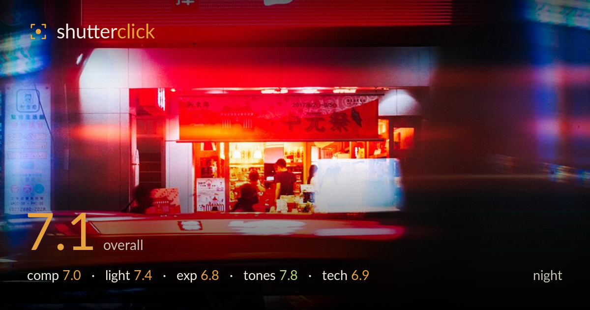
Neon streaks past a night shopfront
Photo by 4601460

No EXIF metadata in this file
Technical analysis based on visual assessment only.
A confident use of motion and neon to build atmosphere, with the red signage anchoring the frame and a sharp, calm shop interior at its centre while everything below dissolves into streaked light. The layering — static top, chaotic bottom — is the strongest idea here. What holds it back is that the motion blur consumes the entire lower half without a single clean anchor to contrast against, so the eye has nowhere to rest low in the frame. The bright red sign also dominates so completely that the more interesting human activity in the shop is easy to miss. A tighter balance between energy and stillness would sharpen the story.
The vertical stack works: the massive red sign crowns the frame, the lit shopfront sits as a warm pocket of stillness at centre, and streaked traffic sweeps across the base. That top-to-bottom rhythm of order dissolving into motion is the composition's real strength. The sign, however, eats nearly the top half and its brightness pulls attention away from the human moment below. The shopfront — the actual heart of the image — sits small and slightly buried. Lowering the sign's dominance or giving the interior more prominence would balance the hierarchy.
The scene is lit entirely by its own signage and interior glow, and that ambient neon does a lot of work — the warm tungsten pocket of the shop reads beautifully against the saturated red above and the cool blues at the edges. The colour temperature contrast between warm centre and cool flanks gives real depth. The red LED sign is powerful but flat and even, offering little modelling; the most shaped, dimensional light is inside the shop, which is where the eye wants more room. A stronger emphasis on that interior glow would pay off.
Exposure is a reasonable compromise for a difficult mix of a blazing LED sign and a dim street. The red panel is near its limit and the finest character detail in the brightest strokes is starting to flatten, though it holds enough to read. Shadows in the lower corners fall deep to black, which suits the mood but swallows some of the streaking traffic detail. The shop interior is well judged — bright enough to reveal the figures without blowing out. A touch less exposure on the sign would have preserved more of its texture.
This is the image's strongest suit. The red-cyan-blue palette is vivid and coherent, and the way warm interior amber sits between cold blue edges and hot red overhead creates a satisfying colour story. The light streaks at the base add greens, teals and reds that echo the wider palette without feeling random. White balance is left deliberately warm inside and cool outside, which reads as intentional rather than an error. Saturation is high but earns it for neon night work. Only the red risks becoming a single undifferentiated block in places.
Without EXIF, the read is from evidence alone. This is clearly a long or slow exposure — the lower half is dominated by directional motion blur from passing vehicles, streaking horizontally into ribbons of colour, which is a deliberate and largely successful choice for conveying night-street energy. Focus sits on the shop interior, which stays crisp enough to anchor the frame against the surrounding movement, suggesting the camera was steady while the traffic moved. Noise is well controlled in the shadows, implying a sensible ISO rather than pushing sensitivity too hard. The trade-off is that the blur is so total across the bottom third that no vehicle or figure resolves into a recognisable form, so the movement reads as abstract texture rather than a legible subject in motion. A slightly faster shutter, or a foreground element sharp enough to contrast the streaks, would have given the motion something to play against. Overall the execution is deliberate and technically sound for the conditions.
What would elevate it
Tags
Shot something like this?
Expert photo critique, on demand — scored across six categories, EXIF-aware. Start with 3 free critiques, no credit card.
critique my photo — free