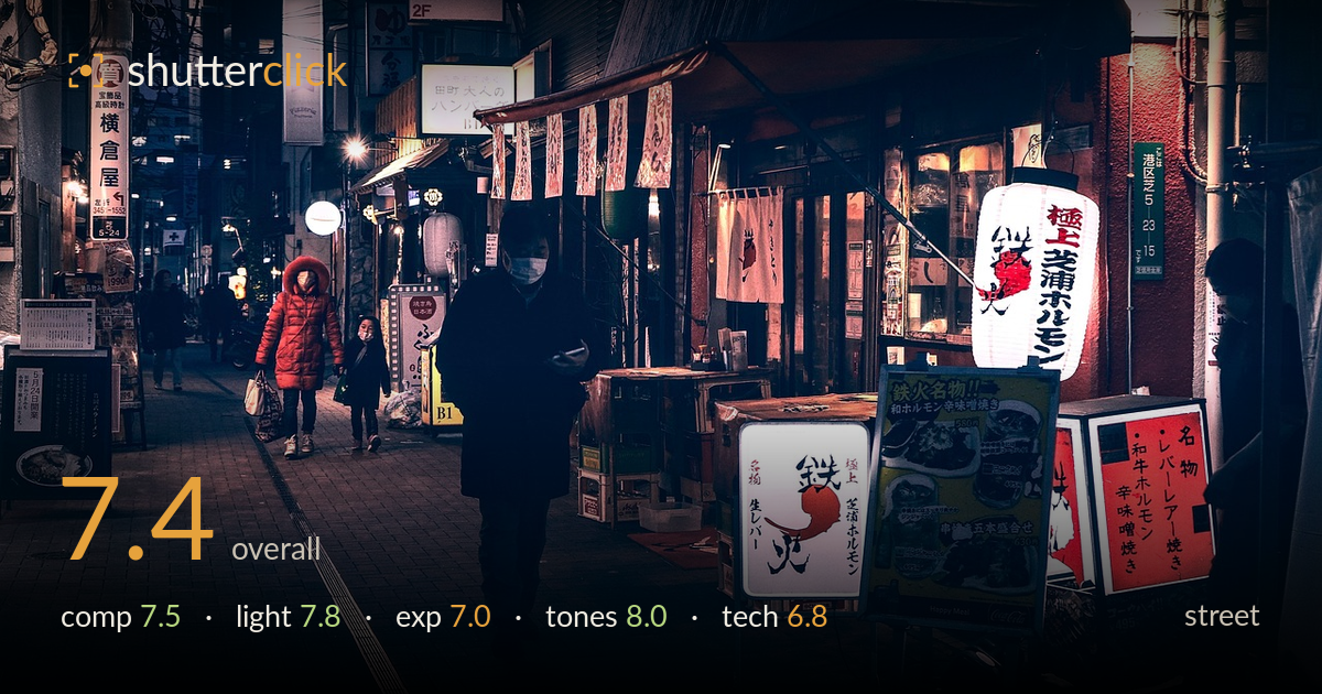
Night alley of glowing signs
Photo by edo_tokyo_

No EXIF metadata in this file
Technical analysis based on visual assessment only.
A well-observed night street scene with a strong sense of place — the layered signage, lanterns, and receding alley build genuine atmosphere. The teal-and-red colour grade is the strongest element, unifying the frame and channelling attention to the illuminated menu boards and lantern on the right. What holds it back most is the central figure: the silhouetted man walking toward the camera is a dark mass with little separation from the shadowed shopfronts behind him, and no face or gesture reads. The red-coated figures in the distance are the more compelling human note but sit small and secondary. A moment with clearer expression would lift this from mood piece to story.
The alley recedes convincingly and the right-hand row of lit signage creates a strong diagonal that pulls the eye deep into the frame. The central walking figure anchors the composition but sits awkwardly — dark against dark, competing with the brighter lantern and menu boards rather than commanding attention. The red-jacketed figures on the left offer a better focal point but are relegated to the mid-distance. Balance leans heavily right where all the illumination clusters. A slightly lower angle or waiting for the subject to reach a pool of light would sharpen the hierarchy.
Mixed artificial light is handled with real feeling — the warm glow of the lantern and menu boards plays against the cooler ambient street, giving the scene depth and mood. The illuminated signs act as natural light sources that carve the right side of the frame. The central figure, however, falls into a dead zone with no rim or fill to describe form, reducing him to a flat cutout. Catching a subject where the lantern or shop light rakes across them would give the human element the modelling it currently lacks.
Exposure is judged sensibly for a night scene — the bright lantern and lit menu boards hold their whites without blowing out, and the deep shadows preserve the nocturnal mood. The trade-off is that the central figure and much of the left foreground sink into near-total black with no recoverable detail, which reads as flat rather than rich. Lifting the shadows a touch in post would reveal texture in the walking figure's coat and the paving without draining the atmosphere. The highlight control on the signage is the exposure's real success.
The teal-and-crimson palette is the image's strongest asset — a coherent, cinematic grade that binds the disparate signage and ambient light into one mood. The reds of the jacket, lantern, and menu boards punch through the cool base and guide the eye effectively. White balance leans deliberately cool, which suits the night register without going unnaturally blue. Contrast is deep but controlled, and the mid-tone gradation in the mid-distance holds up. The saturation sits just short of overcooked — a confident, well-managed colour treatment throughout.
Without EXIF, judgement rests on visible evidence. Sharpness is respectable across the lit signage — the lantern characters and menu text read cleanly — suggesting a steady hand or adequate support at what was likely a slow shutter for these light levels. Noise is kept in check in the shadows, though there is some smearing in the darkest areas that hints at aggressive noise reduction, which softens fine texture. The walking figure shows no obvious motion blur, so the shutter was fast enough for his pace. Focus appears to sit on the mid-ground signage rather than the central subject, which compounds his lack of presence. Depth of field is broad enough to keep the alley and shopfronts legible, appropriate for an environmental street frame. The main technical gain would come from committing focus and a hint of light to the human subject, and easing the shadow noise reduction to retain texture in the coat and paving.
What would elevate it
Tags
Shot something like this?
Expert photo critique, on demand — scored across six categories, EXIF-aware. Start with 3 free critiques, no credit card.
critique my photo — free