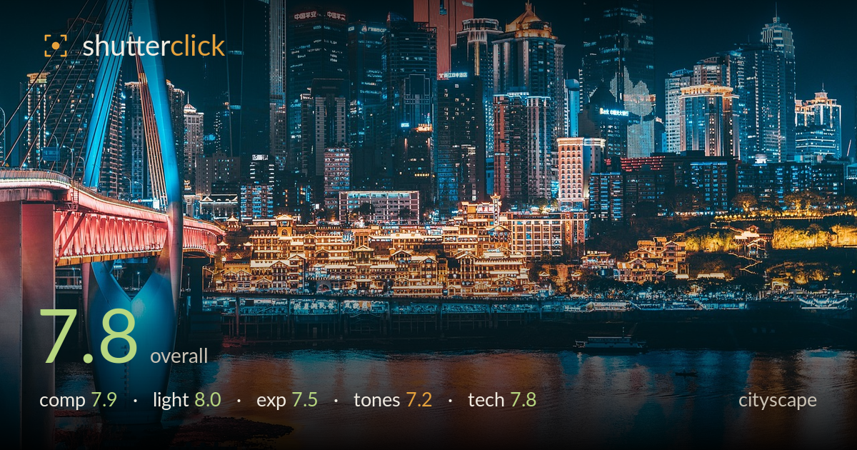
Night skyline over the river
Photo by jcx516

No EXIF metadata in this file
Technical analysis based on visual assessment only.
A dense, layered nightscape that reads with confidence — the bridge pylon anchors the left, the illuminated riverside stilt-house district glows warmly at centre, and the towers stack into depth behind. The strongest element is the layering: foreground bridge, mid-ground riverbank, and background skyline all separate cleanly. What most holds it back is the colour grade, which pushes hard into the teal-and-orange split until the blues look almost cyan-artificial and the overall balance feels manufactured rather than observed. The river reflections carry the frame beautifully. Dialling back the saturation and warming the shadows slightly would let this scene breathe.
The layering is the real achievement here — bridge pylon, glowing riverbank, and tiered skyline read as distinct planes that build genuine depth. The bright historic district sits well at the lower-centre golden zone, and its reflection extends the frame downward. The bridge on the left provides a strong vertical counterweight to the massed towers on the right. The waterline sits low enough to give the skyline room. The right edge feels slightly busier and heavier than the left, and a touch more river foreground would have balanced the tall crop.
The mix of artificial light sources is handled well, with the warm sodium glow of the stilt-house district playing against the cooler LED-lit towers behind. That warm-cool contrast is what gives the scene its structure and pulls the eye to the centre. The bridge's red underlighting and blue pylon add a deliberate accent without dominating. Highlight rendering on the brightest signage stays mostly controlled. The overall balance between ambient sky darkness and built illumination is judged well for the blue-hour-into-night window.
Exposure holds a wide range gracefully for a night scene, keeping shadow structure in the darker towers while preserving detail across the brightly lit riverbank. The brightest signage and window banks flirt with clipping but largely retain texture. The sky reads clean and dark without crushing the tower silhouettes into mush. The reflections in the water keep their gradation. A slightly more restrained lift in the deepest shadows would have avoided the faintly milky, lifted-black look that softens contrast at the bottom of the frame.
This is where the image works hardest against itself. The teal-and-orange grade is pushed far enough that the blues drift toward an artificial cyan, and the warm riverside oranges verge on over-saturated. The split works as spectacle but sacrifices believability — the towers no longer feel lit by real light. White balance in the cool areas reads cold rather than neutral-blue. Pulling saturation back ten to fifteen percent and letting the shadows carry a hint of warmth would restore a more natural, less processed tonal range.
The frame holds up well on close inspection. Sharpness across the skyline is strong, with fine window and signage detail resolving cleanly from the bridge cables through to the distant towers, suggesting a well-chosen aperture and a stable support given the low light. Noise is kept in check in the sky and shadows, pointing to a sensible ISO and a longer exposure rather than a pushed handheld frame. The reflections show a slight softening consistent with gentle water movement over a longer shutter, which reads naturally rather than as a flaw. Depth of field is deep enough to keep both the foreground pylon and the far skyline acceptably crisp. The lens choice frames the scene with minimal obvious distortion, and verticals on the central towers stay reasonably upright. The main technical caveat is the aggressive post-processing rather than capture — the grade introduces some tonal harshness that no in-camera setting caused. Clean, competent execution overall.
What would elevate it
Tags
Shot something like this?
Expert photo critique, on demand — scored across six categories, EXIF-aware. Start with 3 free critiques, no credit card.
critique my photo — free