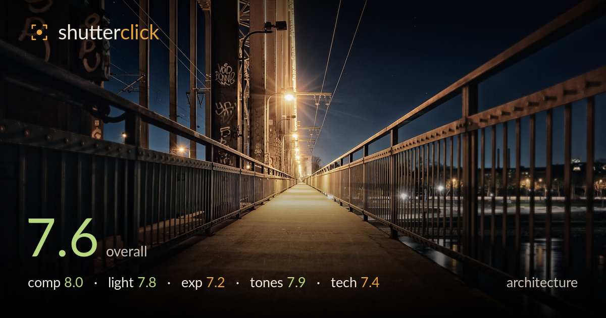
Night walk across the rail bridge
Photo by Tama66

No EXIF metadata in this file
Technical analysis based on visual assessment only.
A confident one-point-perspective walk across a rail bridge at night, with the low camera position pulling the eye straight down the deck to the vanishing point. The lighting reads clearly as blue-hour ambient against warm sodium fixtures, and that colour split gives the frame its atmosphere. What holds it back most is the bright lamp burning into the upper-left steelwork, where highlights clip, and the slightly heavy shadows swallowing the left truss detail. The graffiti-tagged girders add texture and grit but slightly compete with the deck as the primary line. A cleaner highlight and a hair more shadow lift would sharpen an already strong image.
The centred one-point perspective is the right call here — the receding railings and deck converge cleanly on the vanishing point and the low, near-symmetrical viewpoint gives real depth and pull. The heavy steel structure on the left balances against the opener river and city lights on the right, so the frame doesn't feel lopsided despite the asymmetric weight. The deck placement is well judged. The only soft spot is the busy tangle of overhead wires and truss at the top, which crowds the sky and slightly muddies an otherwise disciplined line structure.
The blue-hour sky against the warm sodium lamps is the strongest asset — that cool-warm split gives the scene its mood and separates the deck from the surrounding steel. The lamp flare with its starburst adds a focal accent at the mid-distance. Direction works well: the raking pool of warm light down the walkway leads the eye. The weakness is the nearest fixture, which blooms hard into the upper-left girders and flattens that region. Slightly earlier in blue hour, or a smaller aperture, would tame the flare.
The overall balance holds a difficult night range reasonably well — the deck retains warm midtone detail and the sky keeps colour rather than going black. The main issue is highlight clipping on the brightest lamp and its bloom into the surrounding steel, where recoverable detail is lost. The left-side trusses fall quite deep into shadow, and some of the graffiti and rivet detail there is being crushed. A bracketed blend, or a slightly darker single exposure protecting the lamps, would preserve both ends more gracefully.
The colour grade is the highlight — a clean teal-and-amber split that suits the subject without tipping into cliché. White balance reads deliberate: the sky stays a natural deep blue while the sodium light keeps its honeyed warmth. Contrast is punchy and the deck's warm gradient rolls nicely toward the vanishing point. Saturation is restrained enough to stay believable. The shadows lean slightly muddy on the left where the near-black meets the warm cast, and a touch of separation there would keep the tonal range from clumping.
Focus is well placed on the deck and railings, holding sharpness through the near-to-mid range, which is exactly what a receding perspective needs. Depth of field appears deep, consistent with a small aperture and long exposure suited to a static night architecture scene — the still, empty deck supports that reading. Noise is well controlled in the shadows, suggesting a low ISO and tripod rather than a hand-held high-ISO grab. The lamp starburst points to a stopped-down aperture, which is a sound choice. The one execution flaw is the blown highlight core on the nearest lamp and its bloom, which no aperture alone fully solves at night — this is where exposure blending or a graduated approach earns its keep. Verticals on the trusses lean slightly with the wide perspective, which is largely forgivable given the deliberate one-point framing, but a hair of perspective correction would tidy the leftmost uprights. Overall a technically clean night capture with one recoverable highlight problem.
What would elevate it
Tags
Shot something like this?
Expert photo critique, on demand — scored across six categories, EXIF-aware. Start with 3 free critiques, no credit card.
critique my photo — free