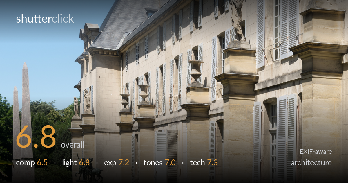
Oblique view of a château facade
Photo by Jebulon

| Focal length | 49 mm |
| Aperture | f / 13.0 |
| Shutter | 1/15 s |
| ISO | ISO 50 |
| Exp. comp. | 0.0 EV |
| Shot at | 13:09 · Jun 10, 2017 |
A receding oblique view of the château that uses perspective to draw the eye along the façade toward the statue-topped pavilion, with the flower bed and lawn providing a useful foreground lead-in. The strong diagonal of the wall and the rhythm of shuttered windows are the main assets. What most holds the shot back is the competing midday light, which keeps the stonework flat, and a slightly indecisive frame — the foreground garden and the architecture are fighting for attention without a clear hierarchy. A cleaner subject decision and softer, lower-angle light would sharpen the image considerably.
The oblique angle generates a powerful diagonal recession down the façade, and the diminishing windows and statues create real rhythm. The foreground flower bed offers a leading line, but it runs out of the lower-left corner without clearly tying into the building. The frame tries to hold both the garden and the architecture and serves neither fully. The flagpole spiking out of the roof and the cropped statue at the far right edge are distractions. A decision between an intimate garden-and-wall study or a full architectural sweep would strengthen it.
Hard, high midday sun falls fairly frontally on the façade, lighting the stone evenly but flatly so the relief of the pilasters, cornices and statuary lacks the modelling that raking light would give. The clear blue sky is clean but contributes no drama. Shadows under the eaves and arches are dense and the highlights on the pale stone sit near the top of the range. A lower sun from the side — early morning or late afternoon — would have carved out the architectural detail and given the columns dimensional weight.
Exposure is well controlled for a bright, high-contrast scene. The pale limestone holds detail without blowing out, and the deep eave and arch shadows retain enough information to read. The blue sky is rendered cleanly without clipping. There is some loss in the darkest recesses beneath the terrace arches, but it is minor and not distracting. The overall balance reads deliberate, holding both the bright stone and the foliage greens within range. A touch of shadow lift would recover the under-eave detail without flattening the image.
The warm honey tones of the stone play nicely against the cool blue sky and the green lawn — a pleasant, natural palette. White balance is accurate and the greens of the garden are realistic rather than oversaturated. Contrast is on the higher side from the hard light, which suits the architecture but pushes the shadows toward heaviness. The pale grey-blue shutters add a subtle accent against the stone. Slightly more separation in the midtones of the façade would help the stonework breathe and reduce the somewhat washed look in the brightest passages.
Settings are sound for the conditions. At f/13 on a 49mm lens, depth of field is deep enough to keep the near flower bed and the distant pavilion acceptably sharp, appropriate for an architectural study where front-to-back clarity matters. ISO 50 keeps the image clean and noise-free, exploiting the bright light. The 1/15s shutter is slow, which on a static building is fine if supported, but the swaying foliage and flowers in the foreground show slight softening from movement — a faster speed or steadier wait between gusts would have crisped them. The 49mm focal length renders the perspective naturally without exaggerating convergence. Verticals on the right-hand pavilion lean inward slightly, typical of an upward tilt; a shift lens or later correction would true them. Focus appears well placed across the façade. Overall the execution is competent and the technical choices align with the subject; the main loose end is the foreground motion at that shutter speed.
what would elevate it
tags
Shot something like this?
Expert photo critique, on demand — scored across six categories, EXIF-aware. Start with 3 free critiques, no credit card.
critique my photo — free