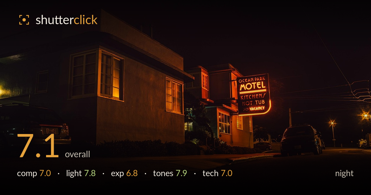
Ocean park motel at night
Photo by StockSnap

No EXIF metadata in this file
Technical analysis based on visual assessment only.
The neon sign is the clear anchor, and the warm glow it throws across the motel's stucco flank gives the frame a moody, cinematic Americana feel. The building's angled corner leads the eye toward the sign effectively. What holds the image back is the vast expanse of near-black foreground road that eats the lower third without offering texture or interest, and a horizon that tilts subtly to the right. The parked cars on both sides are dead weight rather than framing elements. A tighter composition that traded dead pavement for the sign and building would concentrate the atmosphere already present here.
The angled corner of the motel draws the eye toward the neon sign, which works as the focal anchor. But the lower third is dominated by featureless black road that adds nothing and unbalances the frame downward. The dark car at left edge is cropped awkwardly and pulls attention without reward. The sign sits reasonably placed off-centre, yet the horizon tilts slightly right. Cropping out much of the foreground pavement and the left car would tighten the frame and let the building and neon carry the composition.
The neon sign is the star, and its warm orange spill across the stucco wall is the image's best quality — genuinely atmospheric and true to the location's character. The lit windows add secondary points of interest and warmth. Distant street lamps provide depth cues on the right. The single-source glow gives strong directional shaping to the building's corner. The only real limitation is how quickly the light falls off into total shadow on the left face of the building, leaving large dead zones with no rendering.
Exposure is handled with restraint appropriate to night work — the neon and lit windows hold colour without blowing out, which is the hard part here. Shadows swallow most of the scene, and while some of that is intentional mood, the foreground road and left building face carry no recoverable detail. The bright sign and windows sit well within range. A slightly longer exposure or brighter midtones would have retained more of the pavement texture and rescued the left side without harming the neon's glow.
The warm amber-to-orange palette is the image's strongest asset, unifying the frame with a consistent tobacco-and-sodium glow that suits the retro motel subject. Contrast between the deep shadows and the neon reads as deliberate and cinematic. White balance leans warm intentionally and it serves the mood. The tonal transition from lit stucco into black is smooth where it matters. Only the coolish green cast on the shadowed left building face slightly conflicts with the otherwise coherent warmth.
Without EXIF the read comes from visual evidence. The sign lettering and stucco texture appear acceptably sharp, suggesting a stable support or a steady long exposure, since no obvious camera shake is present. Depth of field looks deep enough to keep both the near car and the distant street lamps rendered, consistent with a small-to-moderate aperture and a wide focal length that captured the corner geometry. Noise is well controlled in the mid-tones, though the deepest shadows show some muddiness that longer exposure or lower ISO would clean up. Focus appears set on the building and sign, which is the right call. The wide lens introduces mild perspective stretch on the near car at frame left, exaggerating its bulk. The overall execution is solid for handheld-difficult night conditions; the main technical gain would come from a slightly longer exposure to lift shadow detail while keeping the neon under control, and from bracketing to blend for cleaner dark regions.
What would elevate it
Tags
Shot something like this?
Expert photo critique, on demand — scored across six categories, EXIF-aware. Start with 3 free critiques, no credit card.
critique my photo — free