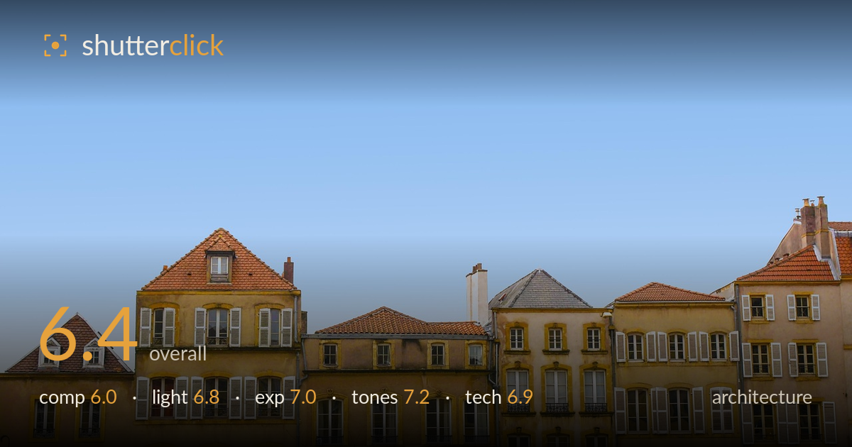
Old town rooftops under blue sky
Photo by mikecook1

No EXIF metadata in this file
Technical analysis based on visual assessment only.
A pleasing rhythm of ochre facades and terracotta rooftops against a clean blue sky, carried by warm-cool colour contrast and varied roofline geometry. The main weakness is proportion: the sky occupies roughly two-thirds of the frame as flat, featureless space that dwarfs the architecture without contributing tension or scale. The buildings — the actual subject — are compressed into a thin band along the bottom. A tighter vertical framing, or a foreground element to anchor the sky, would rebalance the image. The gradient sky is smooth and the facade detail holds up well; the concept is sound, the ratio just needs discipline.
The staggered rooflines create genuine visual interest, and the gabled dormers give the skyline a satisfying rhythm. The problem is the sky-to-subject ratio: empty blue fills roughly the top two-thirds while the buildings are squeezed into a low band. That much negative space needs a reason — a bird, a cloud, converging lines — and here it reads as dead weight rather than deliberate breathing room. The horizon of rooftops sits low, which can work, but the buildings feel undersold. A crop bringing the roofline higher would concentrate attention where it belongs.
Soft, fairly high-angle daylight gives even illumination across the facades, letting the ochre tones and window detail read clearly without harsh clipping. The light is a touch flat, though — there's little raking shadow to model the relief of cornices, shutters and roof tiles, so the surfaces look somewhat two-dimensional. Late-afternoon side light would rake across the facades and pull texture from the stucco and tiles. As it stands the lighting is clean and workable but does little to dramatise the architecture's character.
Exposure is well controlled. The bright sky retains gradation without blowing out, and the sunlit facades hold highlight detail in the pale plaster. Shadows under eaves and within window recesses keep detail rather than crushing to black, indicating a good handle on dynamic range across a bright scene. Midtones on the ochre walls sit comfortably. Nothing here looks accidental — the brightness reads as a deliberate, competent capture of a high-key daylight scene. Little to fault on the technical brightness front.
The warm-cool relationship is the image's strongest asset: saturated terracotta and ochre against a graduated cerulean sky. White balance looks accurate, the plaster reading believably warm. The sky gradient is smooth and free of banding. Saturation is pushed slightly, which flatters the roof tiles but nudges the blue toward postcard territory; a touch more restraint would feel more natural. Contrast is moderate and suits the airy daytime mood. Overall a clean, pleasing palette with good separation between the architectural warmth and the cool background.
Focus appears accurate across the facades, with the window frames, shutter louvres and roof-tile courses rendered crisply from left to right — consistent with a well-chosen aperture giving front-to-back sharpness on a distant subject. No obvious motion blur or camera shake, and noise is negligible in both the sky and shadow areas, suggesting a low ISO in good light. The lens shows only mild distortion; verticals on the taller right-hand building lean slightly and the whole roofline tilts a touch, both correctable in post. For architecture, tighter attention to keeping verticals true and the frame level would lift the technical execution. Perspective is largely frontal, which suits this facade study and avoids severe keystoning. A slightly longer focal length paired with a higher shooting position, or a modest crop, would have let the buildings fill more of the frame without sacrificing the clean geometry already captured here. Solid, careful capture overall.
What would elevate it
Tags
Shot something like this?
Expert photo critique, on demand — scored across six categories, EXIF-aware. Start with 3 free critiques, no credit card.
critique my photo — free