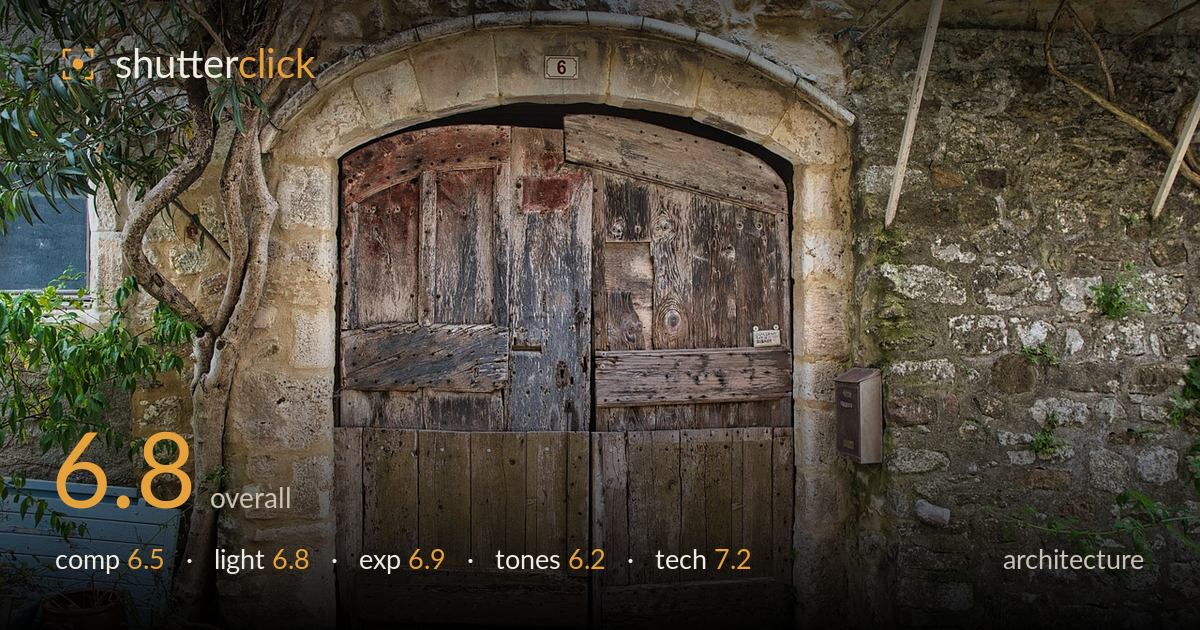
Old wooden door at number six
Photo by lecreusois

No EXIF metadata in this file
Technical analysis based on visual assessment only.
A characterful rustic doorway with strong textural appeal — weathered wood against dressed stone and rubble walls carries genuine atmosphere. The arched door is well centred and the number plaque anchors the top nicely. What holds it back most is the HDR-leaning tone treatment, which flattens contrast and lends the stone a grey, slightly grimy cast that saps the warmth this Provençal scene should have. The composition is solid but static, and the potted plants and blue crate in the lower left compete without fully earning their place. Cleaner tones and a more considered handling of the foreground clutter would lift this considerably.
The arched door sits centrally and the stone surround frames it well, with the tree on the left adding organic contrast to the geometry. The number 6 plaque provides a satisfying top anchor and the mailbox balances the right. However, the frame feels evenly weighted and static — the lower-left pots and blue crate crowd the corner without contributing to the story, and the top edge crops the arch keystone slightly tight. A touch more headroom above the arch and a cleaner foreground would sharpen the reading.
Soft, diffuse open-shade light suits the subject, rendering the stone and wood grain evenly without harsh shadows that would hide detail. The overcast quality keeps highlights controlled across the pale limestone surround. The trade-off is a lack of directional modelling — the raking side light that would make the weathered wood texture leap forward is absent, leaving the surfaces somewhat flat. Light that skimmed across the door face would carve out far more of the grain and character already present in the timber.
Exposure is well managed across a demanding range of pale stone and dark timber. Highlights on the limestone arch hold detail without clipping, and the shadowed recesses of the door retain texture. The window at left edges toward blocked black but reads as intentional. The overall balance is competent and even, though the HDR-style tone mapping has compressed the dynamic range in a way that leaves midtones slightly muddy rather than letting the natural contrast breathe.
This is the weakest area. The tone-mapped processing has drained warmth from the scene, giving the stone a grey, dirty cast rather than the honeyed limestone tone that would suit a southern French doorway. Local contrast is exaggerated, producing a slightly gritty, HDR look that fights the subject's natural charm. The greens of the foliage read dull and the wood loses its richness. A warmer white balance and a lighter processing hand would restore the sun-bleached Mediterranean palette the scene calls for.
Focus is accurate across the door and stonework, with detail holding well from the arch keystone down to the timber planks — depth of field appears more than sufficient to keep the whole facade sharp, suggesting a well-chosen aperture for this flat subject plane. There is no visible motion blur and noise is not an issue in this even light. The lens renders the scene without obvious distortion, and the verticals of the stone jambs stand acceptably straight, which matters for architecture. The main technical limitation is the post-processing rather than capture: the tone-mapping introduces mild haloing around high-contrast edges, particularly where the pale arch meets darker wood, and lifts local contrast to the point of looking artificial. Sharpening also appears slightly heavy, contributing to the gritty texture. Cleaner capture-stage decisions were sound; a more restrained processing chain would let that technical foundation show through, preserving the fine grain of the wood without the crunchy over-processed edge it currently carries.
What would elevate it
Tags
Shot something like this?
Expert photo critique, on demand — scored across six categories, EXIF-aware. Start with 3 free critiques, no credit card.
critique my photo — free