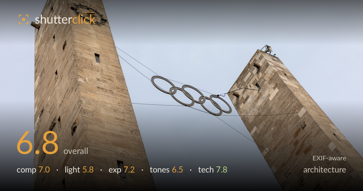
Olympic rings between the towers
Photo by Dietmar Rabich

| Focal length | 42 mm |
| Aperture | f / 10.0 |
| Shutter | 1/320 s |
| ISO | ISO 100 |
| Exp. comp. | 0.0 EV |
| Shot at | 08:34 · May 26, 2019 |
The twin towers of Berlin's Olympic Stadium form a strong V, with the suspended Olympic rings cradling the negative space between them — a genuinely effective use of the gap. What most holds the image back is flat, overcast light that renders the limestone dull and grey, muting the surface texture that makes this brutalist stonework compelling. The rings, the clear subject, sit small and low-key against the pale sky. The upward angle and converging lines suit the monumental scale, but the empty sky dominates more than the architecture. Stronger raking light would transform this considerably.
The two towers leaning inward create a natural frame, with the Olympic rings suspended in the void between them as the anchor — a smart read of the space. The left tower with its clock carries more visual weight and balances the composition well. The rings sit slightly low and small in a large expanse of sky, so the eye works to find them. Tighter framing around the gap, or positioning the rings nearer a third intersection, would give the subject more presence against so much empty sky.
Flat, diffuse overcast light is the weakest element here. It renders the limestone evenly but kills the surface relief — the block joints and weathering that give this stone its character stay muted. There is no directional modelling to separate the tower faces or add depth to the vertical planes. The rings, a dark metal against pale sky, get no rim or catch light to lift them. Low, raking side light, or the warmer directional light of late afternoon, would carve out the masonry texture dramatically.
Exposure is well controlled for a bright-sky-against-stone scenario. The pale sky holds together without blowing out, and the limestone retains full detail in its midtones and highlights. The shadowed window recesses and the underside of the towers keep detail rather than blocking up. No exposure compensation was needed and none applied — a sound call. If anything, the sky reads slightly flat and could take a touch more separation, but the histogram is clean end to end with no meaningful clipping.
The palette is honest but muted — the sandy limestone against a cool, near-white sky gives a restrained, slightly cold cast that matches the overcast conditions but does little to flatter the stone. Contrast is low, which compounds the flat lighting and leaves the towers feeling grey rather than golden. White balance leans cool. A warmer treatment and a modest contrast lift would separate the stone from the sky and give the masonry the warmth it naturally holds under better light.
Execution is clean and well judged. At 42mm on the 5D Mark IV, f/10 delivers front-to-back sharpness across both towers and the suspended rings, and the block joints in the stonework are crisp. ISO 100 keeps the file noise-free with full tonal latitude, and 1/320s is more than sufficient for a static handheld subject at this focal length. Focus is accurate on the near tower face. The one technical consideration worth naming is perspective: the strong upward tilt causes the verticals to converge dramatically. That convergence is used expressively here to emphasise scale, so it reads as intentional rather than accidental keystoning — but a tilt-shift lens or a corrected perspective in post would be the alternative for a more formal architectural rendering. The f/10 aperture is a sensible middle ground that avoids diffraction softening while guaranteeing depth of field. Overall a technically confident capture.
What would elevate it
Tags
Shot something like this?
Expert photo critique, on demand — scored across six categories, EXIF-aware. Start with 3 free critiques, no credit card.
critique my photo — free