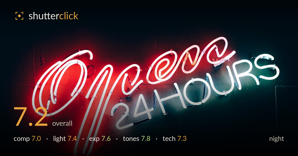
Open 24 hours in neon
Photo by StockSnap

No EXIF metadata in this file
Technical analysis based on visual assessment only.
A confident, graphic neon study that leans on strong colour contrast — hot red against cool teal-white — to carry the frame. The dark wall gives the glow room to breathe, and the exposure protects the neon tubing from blowing out while keeping the surround genuinely black. What holds it back is the composition's slight aimlessness: the sign sits low and drifts left, leaving a large, mostly empty upper-right quadrant that doesn't quite earn its space. Focus and detail are solid, though the tightest sharpness lands unevenly across the tubes. A more deliberate crop and cleaner framing would lift a good record shot into a strong one.
The diagonal sweep of the script gives the frame energy, and the black surround isolates the subject cleanly. But the sign hugs the lower-left, and the large empty upper-right area reads as dead space rather than intentional negative space. The right edge crowds the final 'S' while the left has more breathing room, creating imbalance. Centring the sign more deliberately, or committing fully to an off-centre placement with a purpose for the void, would resolve the tension. The tilt of the lettering works; the framing around it is what wavers.
The light source is the subject itself, and its self-illumination is handled well — the red script and teal 'HOURS' glow at full saturation without dissolving into pure white cores across most of the tubing. The falloff onto the surrounding wall gives a soft halo that adds atmosphere and reveals just enough surface texture near the letters. The colour separation between warm and cool zones is the image's strongest lighting asset. A touch more of the wall's ambient spill would have added context, but the restraint keeps the mood pure.
Exposure is well judged for a self-lit subject in darkness — a genuinely difficult balance. The blacks fall to near-true black without crushing the faint wall detail into mud, and the brightest neon cores hold their tube structure rather than clipping to featureless white. The reds sit right at the edge of saturation clipping in the hottest sections of the script, which is where a small amount of highlight recovery would help. Overall the tonal placement looks deliberate, not accidental, and the dynamic range is used sensibly.
The colour story is the highlight: a bold complementary pairing of red and teal-white that reads instantly and holds together. White balance is neutral enough that the whites stay clean while the accent colours pop. Contrast is strong and appropriate for neon, with the deep surround letting the hues sing. The red channel edges toward oversaturation in the densest areas, flattening some tube detail there. Slightly dialing back red saturation and lifting a hint of the cool tones would deepen the gradation without weakening the punch.
Focus lands accurately on the neon tubing, and the fine detail — the mounting clips, the glass supports, the subtle grain of the wall — is resolved cleanly where light reaches it. Depth of field appears sufficient to keep the whole sign acceptably sharp despite the diagonal recession, which suggests a sensible aperture choice. Noise in the shadows is well controlled for a night frame; the blacks stay smooth rather than mottled, pointing to a reasonable ISO and clean handling. The main technical limitation is that the sharpest plane isn't consistent across the full width of the sign — the far letters read marginally softer, likely a mix of the angle and depth-of-field limits. Nothing here undermines the image; execution is solid and confident. Sharpening applied selectively to the softer right-hand letters in post, or a slightly stopped-down aperture on a reshoot, would even out the crispness across the frame.
What would elevate it
Tags
Shot something like this?
Expert photo critique, on demand — scored across six categories, EXIF-aware. Start with 3 free critiques, no credit card.
critique my photo — free