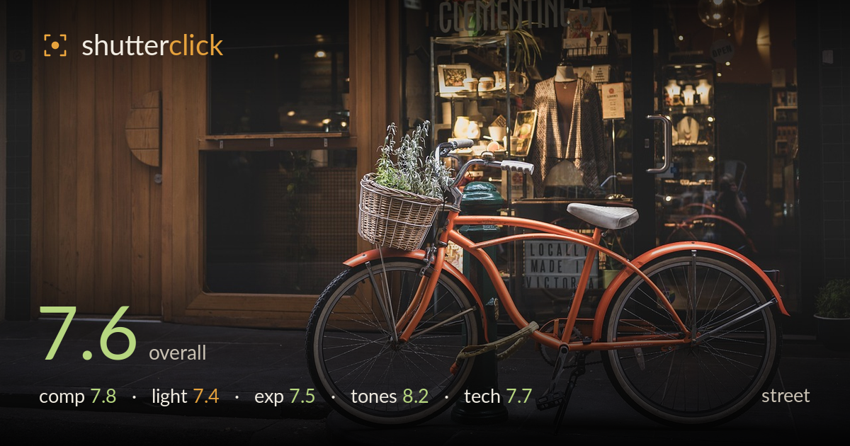
Orange cruiser outside the shop
Photo by pen_ash

No EXIF metadata in this file
Technical analysis based on visual assessment only.
A polished, well-observed storefront vignette where the orange cruiser anchors a warm, cohesive scene against the softly lit shop window. The colour harmony between the bike, the Clementine's citrus logo, and the timber facade is the strongest asset, and the composition reads cleanly. What holds it back is a lack of human presence — this is a still-life-of-the-street rather than a decisive street moment, so it feels more like a lifestyle catalogue frame than reportage. The bike is parked and static; a passing figure, a shopkeeper, or any gesture would inject the life the genre rewards. Beautifully executed, but narratively quiet.
The bike sits low and heavy across the lower two-thirds, its two wheels and the diagonal frame creating a stable, readable shape against the storefront. The wicker basket of lavender adds a pleasing focal accent and echoes the window display behind. The green bollard and pendant lamps balance the right side. The main weakness is that the front wheel nearly kisses the left edge, feeling slightly cramped, while the timber door on the far left is a large, low-information block. A touch more breathing room ahead of the wheel would improve the flow.
The light is soft and diffuse — overcast or shaded ambient — which suits the calm mood and renders the timber and bike frame without harsh highlights. The interior shop lighting provides a warm glow that draws the eye deeper and adds dimension behind the subject. Shadows are gentle and never blocky. The trade-off is a slightly flat quality on the bike itself; a bit more directional light or a raking side glance would carve more form into the frame and lend the metal and chrome extra sparkle.
Exposure is well judged for a difficult mixed-light situation. The bright shop window interior holds detail rather than blowing out, and the shaded facade retains texture in the timber and darker recesses. The bike's orange sits at a comfortable midtone with the chrome spokes still legible. Deep shadows in the doorway and lower right go dark but purposefully so, not crushed to mud. Nothing important clips. If anything, a fraction more shadow lift on the near foreground pavement would open the base of the frame without harming the mood.
The tonal treatment is the highlight — a warm, muted palette where the burnt-orange bike, the citrus logo, and the honeyed timber all sing together, offset by the cool green bollard and darker window frames for just enough contrast. White balance leans warm intentionally and reinforces the cosy, boutique atmosphere. Saturation is restrained and tasteful, and the gradation from warm highlights into shadow is smooth. It reads as a considered, cohesive grade rather than an accident of the ambient light, and it elevates an otherwise simple scene.
Focus is placed accurately on the bike, with the frame, basket, and near wheel rendering crisply and the storefront falling into a soft but still-legible background — a sensible depth choice that separates subject from setting without erasing the context that gives the shot meaning. There is no motion blur, unsurprising given the static subject, and the image appears clean of noise, suggesting a low ISO in adequate light. The lens perspective is natural, without obvious distortion, and the verticals of the door and window read acceptably straight. Sharpness across the bike is consistent and the chrome detail in the spokes survives well. The one technical consideration is depth of field: the background is soft enough to read as intentional separation, but the Clementine's signage and window display carry so much narrative weight that a slightly deeper stop might have let them contribute more without pulling attention from the bike. Overall, execution is confident and controlled throughout.
What would elevate it
Tags
Shot something like this?
Expert photo critique, on demand — scored across six categories, EXIF-aware. Start with 3 free critiques, no credit card.
critique my photo — free