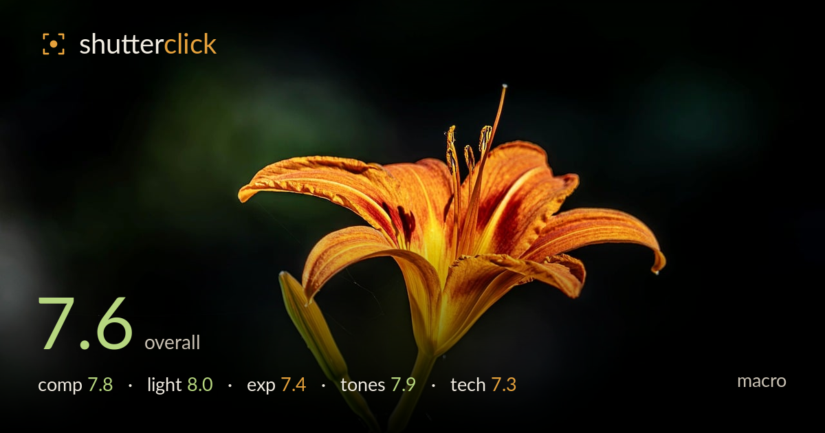
Orange daylily against the dark
Photo by terbe_rezso

No EXIF metadata in this file
Technical analysis based on visual assessment only.
A daylily rendered with strong colour and clean light against a deep, uncluttered background — the standout being how the warm orange bloom separates from the dark green fall-off. The flower sits in the upper right with the stem and bud tracing a graceful diagonal down to the lower frame, giving the composition genuine flow. What holds it back most is focus: the plane of sharpness catches the near petals and stamens but the anthers and some petal edges drift soft, and a stray strand of cobweb crosses the frame. Tightening the focus and cleaning those distractions would elevate an already handsome image.
The flower placed upper-right with the stem and bud sweeping down-left builds a satisfying diagonal that carries the eye through the frame. Negative space on the left breathes rather than feels empty, and the dark surround isolates the subject cleanly. The bud echoing the bloom adds a nice secondary element. The flower crowds the right edge slightly — one petal tip nearly touches the border — so a touch more room on that side would ease the tension without losing the dynamic placement.
Directional light rakes across the bloom from the front-right, modelling the petal ridges and lighting the throat with a warm glow that gives the flower dimension. The background falls to near-black, a natural spotlight effect that suits the subject. Highlights on the petals stay controlled and the stamens catch light cleanly. The stem and bud are lit a shade flatter than the bloom, so a hint of fill or a slightly repositioned angle would carry the modelling down through the whole plant.
Exposure is judged to protect the bright orange petals, and they hold their detail without the throat blowing out — a sensible priority given how easily saturated oranges clip. The deep background retains just enough tonal variation to read as a scene rather than pure black. Some of the brightest petal edges sit close to the top of the range; pulling those highlights back a fraction would recover the last texture. Overall a deliberate, well-controlled exposure for a high-contrast subject.
The orange-to-yellow gradient through the petals and throat is rich and believable, with good separation between the warm bloom and the cool green stem. White balance reads accurate — the greens are natural rather than yellow-shifted. Contrast is strong and suits the moody, spotlit treatment. Saturation on the orange runs high but stops short of looking artificial. The darkest background areas crush to flat black in places; retaining a whisper more shadow gradation would give the surround more depth.
The core of the bloom and the near petals show good sharpness with well-resolved texture in the ridged petal surfaces, but the depth of field is shallow enough that the anthers, some petal tips, and the far edge of the flower fall soft. For macro, where the key plane matters most, focus placement or a small focus stack would bring the whole flower head into crisp register. The bud and stem sit acceptably sharp given their position closer to the focal plane. A fine strand of cobweb crosses the frame between the bud and the bloom — visible enough to distract and worth cloning out. Noise is well controlled in the shadows and the background bokeh is smooth and pleasing, with no harsh edges. The lens renders colour and out-of-focus areas nicely. The main gains here are on the focus front: a slightly deeper aperture or stacking would resolve the softness on the flower's far structures without sacrificing the clean background.
What would elevate it
Tags
Shot something like this?
Expert photo critique, on demand — scored across six categories, EXIF-aware. Start with 3 free critiques, no credit card.
critique my photo — free