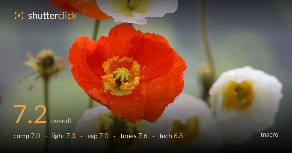
Orange poppy among white blooms
Photo by diegartenprofis

No EXIF metadata in this file
Technical analysis based on visual assessment only.
A vivid orange Iceland poppy anchors a well-managed field of white blooms, and the colour contrast between the single warm subject and the cooler surroundings carries the frame. The soft grey-green background isolates the flowers cleanly and the shallow depth of field is used to good effect. What most holds the image back is focus placement: the sharpest detail sits on the red petals and stamen rim rather than being fully resolved across the key stamen cluster, and the surrounding white poppies compete for attention. A more decisive single-subject treatment and tighter focus discipline would lift this from pleasant to striking.
The red poppy is placed left of centre with white blooms filling the lower and right zones, giving a loose balance that mostly works. The diagonal stems add subtle structure and lead the eye upward. However, the frame is busy for a macro — several white poppies and the clipped bloom at top edge dilute the focus. The strong red subject and the lower-right white poppy pull attention in two directions. A cleaner isolation of the orange flower, or a deliberate pairing of just two blooms, would resolve the competing interest.
Soft, diffuse light — likely overcast or shaded — suits these delicate petals, avoiding harsh highlights on the crinkled white surfaces and preserving the translucency of the orange poppy. Shadow rendering is gentle and the modelling of the petal folds reads well. The flat quality does limit dimensionality, though; the white blooms in particular lack the raking direction that would carry their crepe-paper texture. A touch of directional side light would add depth without sacrificing the softness that already serves the reds nicely.
Exposure is well controlled overall. The white poppies hold detail in their petals with only minor loss in the brightest folds, which is a genuine achievement given how easily whites blow out. The orange poppy retains saturation and internal petal structure without clipping into a flat mass of red. Shadows in the flower centres keep detail. The background sits a touch bright and grey, slightly reducing subject-to-background separation. A marginally darker exposure would have deepened that separation and made the orange pop harder against the muted backdrop.
The palette is the strongest element — a confident warm-cool relationship between the saturated orange, the creamy whites, and the desaturated blue-grey background. White balance is neutral to slightly cool, which flatters the greens of the stems and keeps the whites clean rather than yellowed. The yellow-green flower centres provide a pleasing tertiary accent. Saturation on the orange is bold but not oversaturated, holding petal texture. Contrast is on the gentle side, consistent with the soft light, and the muted background gives the colours room to breathe.
The shallow depth of field is appropriate for macro flower work and produces a smooth, unobtrusive background that isolates the subjects effectively. The problem is focus precision: the plane of sharpest focus appears to fall on the outer red petals and the near stamen rim rather than being fully locked onto the central stamen cluster, which is where the eye wants maximum detail in a poppy. The stamens read as soft rather than crisp. With this thin a focus zone, the choice of focal plane is everything, and here it drifts slightly forward. Focus stacking would have resolved the entire orange bloom while retaining the soft surround. Noise is well controlled and there is no visible motion blur, so shutter speed handled any breeze adequately. The lens renders pleasant, non-distracting bokeh. Nailing focus on the stamens, or blending a two-to-three-frame stack, would be the single most impactful technical improvement for this kind of subject.
What would elevate it
Tags
Shot something like this?
Expert photo critique, on demand — scored across six categories, EXIF-aware. Start with 3 free critiques, no credit card.
critique my photo — free