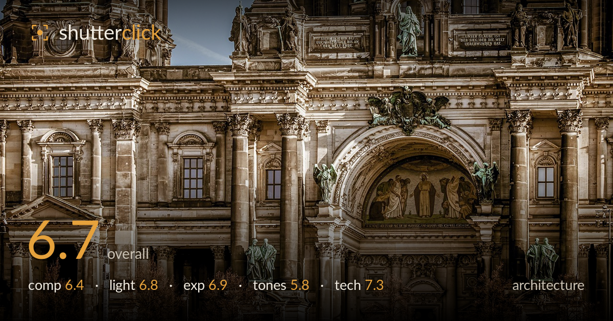
Ornate facade of the berlin cathedral
Photo by Couleur

No EXIF metadata in this file
Technical analysis based on visual assessment only.
A dense, detail-rich facade of the Berlin Cathedral rendered with strong sharpness and generous ornament, but the frame reads as an even wall of texture without a clear anchor, and the heavy warm-toned grade pushes the image toward a stylised, HDR-adjacent look. The compression flattens the depth, so the eye has no obvious path through the columns, statues, and mosaic. The green oxidised copper against sandstone is the most compelling relationship in the frame. Reining in the tonal processing and choosing a single dominant element — the central mosaic arch, most likely — would give this the focus its craftsmanship deserves.
The tight crop isolates a slice of the facade, which shows off ornamentation but leaves no clear focal hierarchy — the mosaic arch, dome, and towers all compete equally. Verticals are largely upright, which suits architecture, but the framing feels arbitrary at the edges, cutting through columns and pediments mid-form. There's little breathing room; the frame is wall-to-wall stone. A composition built around the central arch as anchor, with the towers as supporting layers, would give the eye somewhere to settle and rest.
Soft, diffused light spreads evenly across the sandstone, avoiding harsh blown highlights but also flattening the relief that makes this architecture worth photographing. The overcast or hazy quality gives consistent exposure across the facade, yet the carvings and column flutes lack the raking shadow that would carve out their depth. A lower-angle side light — early or late in the day — would rake across the stone and reveal the sculptural texture that currently reads flat. The green copper accents survive the flat light best.
Exposure is well controlled across a demanding subject — the pale sandstone holds highlight detail without clipping, and the shadowed recesses under the arch and window bays retain readable information. The blue sky in the upper left is clean and unblown. The overall balance leans slightly dark and heavy in the midtones, part of the grading choice rather than a metering error. Nothing is lost at either end of the histogram, which is an achievement given the bright stone and deep shadow contrast in the frame.
This is where the image works hardest against itself. The warm sepia-orange grade is pushed heavily, giving the stone an artificial, over-processed cast that flirts with an HDR look — local contrast is cranked and the midtones feel muddy. The oxidised copper greens are the saving grace, providing colour contrast, but the overall palette is monotone and heavy. A cooler, more neutral white balance and gentler contrast would let the natural sandstone tones and the copper patina speak without the processing calling attention to itself.
Focus and sharpness are strong throughout — the carved detail, statuary, and mosaic figures all resolve crisply, suggesting a well-chosen aperture and careful capture from a stable position. A longer focal length has been used to compress the facade, which is evident in how the towers and foreground columns stack flatly against one another; this compression is the main technical characteristic shaping the image, and it works against the sense of depth. Depth of field appears sufficient to hold the entire plane sharp, appropriate for architecture. Noise is well controlled and the fine ornament shows no smearing. The heavy local-contrast processing introduces a slightly crunchy, over-sharpened quality in the stone texture that a lighter hand would avoid. Verticals are close to true, though a subtle check for converging parallels would confirm perspective control. Overall the capture is technically clean; the processing is where restraint would pay off most.
What would elevate it
Tags
Shot something like this?
Expert photo critique, on demand — scored across six categories, EXIF-aware. Start with 3 free critiques, no credit card.
critique my photo — free