Ornate tiled panel in bloom
Photo by Alvesgaspar

| Shot at | 16:19 · Dec 1, 2012 |
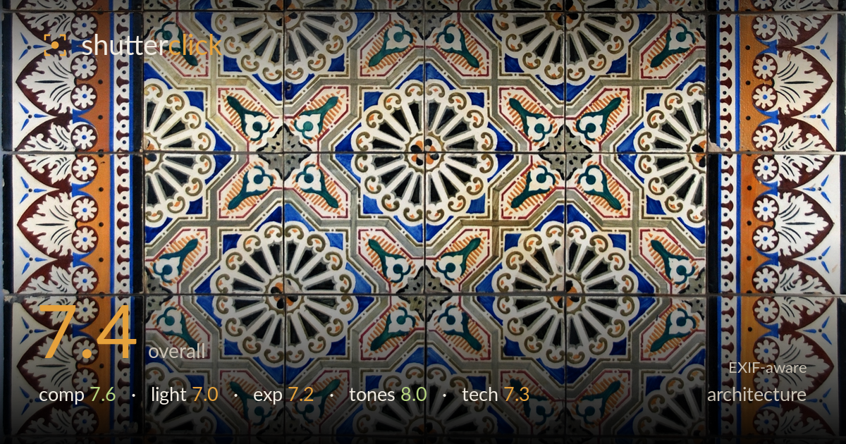
A disciplined, symmetrical documentation of a decorative tile panel that reads as a strong flat-on study of pattern and colour. The nested border-within-border framing is the frame's greatest asset, and the earthy palette against cobalt blue registers cleanly. What most holds it back is the slight departure from true squareness: the panel's edges are not perfectly parallel to the frame, so verticals drift near the corners, and the very top edge crops the outer tiles unevenly. Even, shadowless light serves the record but flattens the glaze's dimensionality. A more rigorous alignment and a light that grazes the surface would lift this from good documentation to considered study.
The concentric border structure is handled well — the eye moves from the acanthus-and-daisy outer frame inward through the blue and ochre bands to the radiating floral core, and the central medallions sit balanced across the vertical axis. The panel fills the frame decisively with minimal wasted space. The weakness is edge control: the top row of tiles is clipped tighter than the bottom, and the left and right margins are unequal, breaking the symmetry the subject demands. Centring this rigorously and squaring every border to the frame edge would reward the geometry.
The even, diffuse illumination is appropriate for copy work — it avoids blown specular hotspots on the glossy glaze and keeps colour legible corner to corner. There are no distracting reflections or hard shadows to fight. The trade-off is that flat frontal light renders the tiles almost as a scan, suppressing the low relief and the subtle surface irregularities that give antique tilework its character. A slightly raking side light, or a single directional source, would carve out the modelling and hint at the ceramic's depth without sacrificing overall evenness.
Exposure is well judged for a high-detail subject. The whites in the daisy motifs hold texture rather than clipping, and the deep browns and blacks retain separation without blocking up. The midtone ochres and blues sit at natural brightness, and the histogram appears to use the full range without pushing either end. A faint unevenness in brightness across the panel suggests the lighting fell off slightly toward one side, but nothing that undermines the record. Overall a clean, deliberate exposure with no accidental crushing or wash-out.
This is the strongest aspect. White balance is neutral, letting the terracotta ochre, cobalt blue, and oxblood browns read true, and the teal accents in the rosettes stay distinct rather than muddying into the greys. Contrast is well controlled — the whites are bright without glowing, and the dark outlines anchor each motif. Saturation feels faithful to aged ceramic rather than artificially boosted. The tonal gradation across the muted greys of the background field is smooth. A very slight overall warmth suits the material well.
Shot on a Nikon D80, this is competent copy work. Focus lands accurately across the tile surface and detail resolves crisply in the painted linework and crazing of the glaze, indicating a sufficiently stopped-down aperture to hold the flat plane sharp edge to edge — appropriate for a frontal subject with no depth to reconcile. Noise is not a concern at what appears to be a low ISO. The main technical shortfall is perpendicularity: the sensor plane is not perfectly parallel to the wall, so parallax causes slight convergence and the border widths differ side to side. For a flat, geometric subject this is the discipline that matters most. Careful tripod levelling with attention to both horizontal and vertical alignment, or a modest perspective correction in post, would square the panel precisely. A slightly longer focal length from further back would also reduce any residual wide-angle stretch at the edges. Sharpness and rendering are otherwise dependable.
What would elevate it
Tags
Shot something like this?
Expert photo critique, on demand — scored across six categories, EXIF-aware. Start with 3 free critiques, no credit card.
critique my photo — free