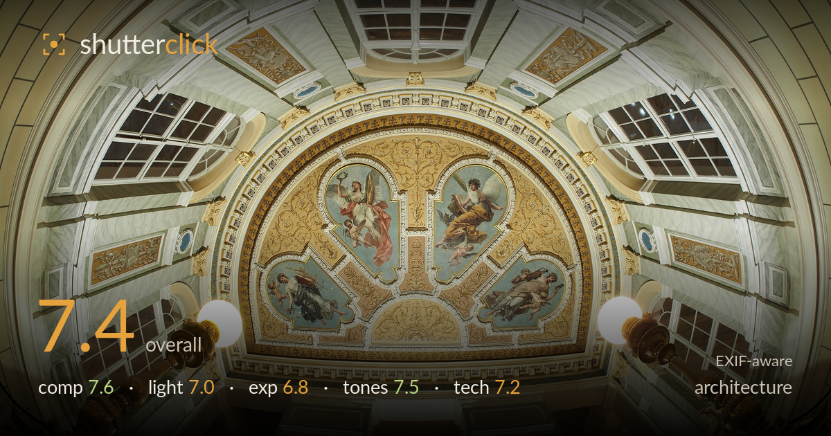
Painted ceiling of a grand hall
Photo by Petar Milošević

| Focal length | 0 mm |
| Aperture | f / 0.0 |
| Shutter | 1/3 s |
| ISO | ISO 200 |
| Exp. comp. | 0.0 EV |
| Shot at | 11:03 · Sep 6, 2015 |
A richly detailed ceiling and mural captured with strong central symmetry and an ambitious wide/fisheye view that gathers the entire vaulted space. The painted lunette is the clear anchor, framed by paired lamps and marbled walls that lead the eye upward. What most holds the image back is the curved, bowing distortion inherent to the fisheye — verticals sweep dramatically and the geometry, though impressive, drifts from the disciplined line control architecture rewards. The two globe lamps also blow out against the darker frame. Handsome, well-organised, and worth refining toward cleaner rendering.
The framing is built on strong central symmetry, with the mural lunette anchoring the middle and the paired brass lamps balancing left and right as foreground markers. The upward view captures the full sweep of the vault, coffered skylight, and flanking windows in one gesture. The reclining statues at the lower corners give scale and ground the frame. The fisheye's barrel bend, however, makes the horizontals bow noticeably, and the very centre feels slightly crowded where mural, arch, and skylight compete. A touch more breathing room below would settle the balance.
Mixed daylight through the windows and warm interior lamplight give the space a pleasant, layered glow, with the mural evenly lit enough to read its detail. The window panels supply cool balance against the golden ornament. The two globe lamps, however, are the harshest elements — they flare bright and flat, pulling attention and adding little modelling. The overall light is even but somewhat undirected, so the intricate plasterwork and gilding lack the raking emphasis that would make texture leap. Softer, more directional light would carve the relief work more convincingly.
Exposure holds the midtones and the mural well, preserving the painted figures and gilt detail without crushing the marbled walls. The dynamic range is handled reasonably for a high-contrast interior. The clear weakness is the two globe lamps, which clip to pure white and lose all form, and the dark window exteriors that fall to near-black. A bracketed blend would recover the lamp highlights and lift shadow detail in the windows. The 1/3s shutter suggests a tripod, giving latitude for a lower-ISO, wider-latitude exposure that this scene would benefit from.
The colour palette is one of the image's strengths — warm creams and golds against the cool blue of the mural and the grey-veined marble create a refined, period-appropriate harmony. White balance leans slightly warm, which suits the gilded interior. Contrast is gentle and the tonal transitions across the plaster read smoothly. The gilt ornament retains richness without oversaturation. Some of the shadowed recesses lean a touch muddy, and the whites of the marble could hold a cleaner point, but the overall grading is tasteful and cohesive.
The EXIF reports 0mm and f/0.0, so the lens communicated no data — consistent with a manual or adapted fisheye, which the pronounced barrel distortion confirms. At 1/3s and ISO 200 the exposure implies a tripod or very steady support, and the frame is largely sharp across the ceiling detail, which is the right priority for architectural interior work. Depth of field is sufficient throughout, and noise is negligible at base ISO. Focus lands well on the mural and plasterwork. The main technical limitation is the uncorrected fisheye geometry, which bows every straight line; for architecture this is stylistic but works against the genre's usual demand for controlled verticals. Defishing in post, or a rectilinear ultra-wide, would tame the sweep while keeping coverage. The blown lamp globes also point to a single exposure struggling with the interior's contrast range — exposure blending would resolve both highlight and shadow detail cleanly.
What would elevate it
Tags
Shot something like this?
Expert photo critique, on demand — scored across six categories, EXIF-aware. Start with 3 free critiques, no credit card.
critique my photo — free