Painted staircase and murals
Photo by Petar Milošević

| Focal length | 10 mm |
| Aperture | f / 4.5 |
| Shutter | 1/1600 s |
| ISO | ISO 125 |
| Exp. comp. | 0.0 EV |
| Shot at | 11:42 · May 11, 2023 |
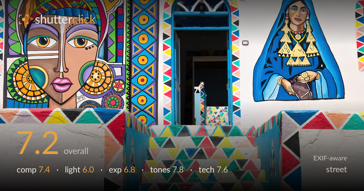
A confident, symmetry-driven frame of a vividly painted Nubian facade, carried by the ascending triangle-patterned staircase that pulls the eye straight to the dark doorway between two large murals. The colour is the clear draw, and the graphic organization is strong. What holds it back most is the light: flat, high midday sun flattens the wall and leaves the dome and painted surfaces without modelling, while the open door is a black void that competes for attention without rewarding it. This reads more as architectural documentation than as a street photograph, since no human presence or moment animates the scene.
The staircase functions as a strong central leading line straight into the dark doorway, with the two murals flanking it in near-symmetry — a deliberate, stable arrangement. The brick dome anchors the top and gives the flat facade some depth. The symmetry is slightly imperfect: the left mural crowds the frame edge while the right woman has more breathing room, and the top edge clips the dome's roofline awkwardly. A touch more headroom above the dome and a centred vantage would resolve the balance without losing the graphic punch.
Flat, hard midday sun does the mural colours no favours and no harm — it renders them evenly but without shape. The white plaster returns strong, even light that keeps everything legible, but there is no directional modelling to give the dome's brickwork or the raised stair edges dimension. The doorway falls into deep shadow, creating a harsh tonal jump the light offers no transition into. Earlier or later light raking across the facade would have carved texture into the plaster and dome and added the depth the frame currently lacks.
Exposure is well judged for the bright whitewashed wall — the highlights on the plaster hold without clipping, and the saturated paint retains detail rather than blowing out. The trade-off is the doorway, which sits as a featureless black rectangle at the visual center; whether intentional or not, it draws the eye to empty shadow. The blue sky is clean and unclipped. A slightly brighter exposure or shadow lift in post would recover a hint of interior detail and soften that abrupt black-to-white transition at the frame's core.
Colour is the image's greatest asset — the murals' primaries and secondaries sing against the white plaster and deep blue sky, and saturation stays rich without tipping into garish. White balance is neutral and the whites read cleanly. Contrast between the crisp geometric paint and the flat wall is handled well. The blue sky provides a calm complementary backdrop to all the warmth below. The only tonal weakness is the doorway's crushed black, which offers no gradation where a little roll-off would have helped the transition read more gracefully.
The 10mm focal length (roughly 27mm equivalent) suits the facade, capturing the full scene from a workable distance, though the wide angle contributes to the mild edge distortion on the left mural. At f/4.5 depth of field is ample for a flat frontal subject, and everything from the stair paint to the dome brick is rendered sharp — focus is accurate across the plane. Shutter at 1/1600s is far faster than a static wall requires, but it costs nothing here and would have frozen any passing figure had one entered. ISO 125 keeps the file clean with no visible noise, ideal for the bright conditions. The verticals are largely upright with only slight keystoning, reasonable for a handheld wide shot. Execution is technically sound throughout; the settings are well matched to a bright, static subject. A one-stop-lower vantage or a small perspective correction in post would tidy the remaining vertical lean.
What would elevate it
Tags
Shot something like this?
Expert photo critique, on demand — scored across six categories, EXIF-aware. Start with 3 free critiques, no credit card.
critique my photo — free