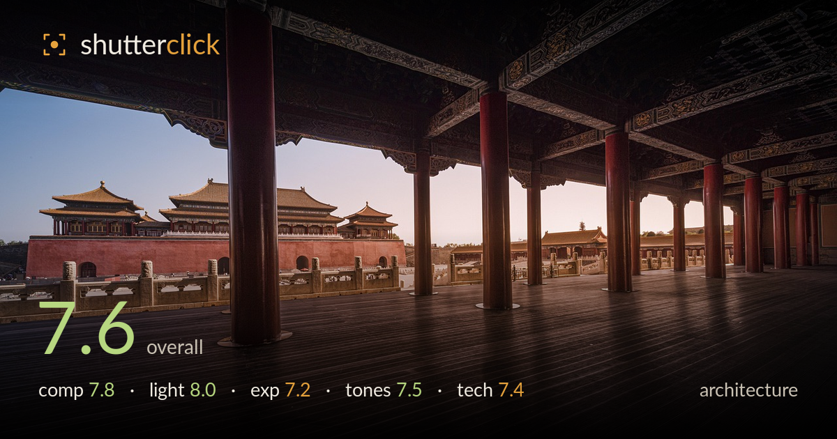
Palace framed through the colonnade
Photo by Jack_Jiao

No EXIF metadata in this file
Technical analysis based on visual assessment only.
A confident use of a foreground colonnade to frame the distant palace complex, and the warm side light on the pavilions is the strongest asset. The device of shooting through the columns from within the sheltered platform gives the image depth and a sense of place. What holds it back is the balance of the frame: the right half is heavy dark deck and shadow with little to reward the eye, and the vertical of the nearest red column sits awkwardly close to the visual centre. Tightening the relationship between the frame's dark and light halves would sharpen the impact considerably.
The colonnade framing works well, layering the near columns against the distant palace and pulling the eye through the arched brackets. The floorboards form strong leading lines toward the buildings. Balance is the weak point: the nearest red column lands near centre and splits the composition, while the right third is dominated by empty dark deck that offers little interest. The distant pavilions sit low-left, a pleasing placement, but a step left or a tighter crop off the right would concentrate weight toward the lit subject and reduce dead space.
Low, warm side light rakes across the palace roofs and the red platform wall, defining the tiered forms and the ornate eaves cleanly. The contrast between the sunlit exterior and the shaded interior platform gives the scene depth and atmosphere. Timing near golden hour serves the architecture, warming the yellow-glazed roofs against the cool sky. The interior ceiling detail falls into deep shadow, which suits the mood but loses much of the painted decoration. A touch of fill or a brighter hour would recover more of that carved ceiling.
Exposure is judged to protect the bright exterior, keeping the roofs and sky from clipping, which is the right priority. The sky retains a clean gradient and the lit stonework holds detail. The trade-off is heavy shadow across the deck and ceiling, where much tonal information is lost to near-black. The darkest foreground boards read as a solid mass rather than textured wood. Lifting the shadows modestly in post would recover deck grain and ceiling ornament without harming the highlight control that already works.
The warm-cool split is handled well: golden roofs and reddish columns against a cool blue-to-peach sky read naturally and pleasingly. White balance sits slightly warm, which suits the hour. The red columns and platform wall carry good saturation without going garish. The dark deck skews toward a muddy brown-black that flattens the shadow range, and the transition from lit stone to shadow is a little abrupt. Slightly warmer shadow tones and a gentle lift would keep the palette cohesive while restoring gradation in the darkest areas.
Depth of field appears well managed for the wide vantage, with the near columns and the distant pavilions both acceptably sharp, suggesting a small aperture and a wide focal length. The ultra-wide perspective introduces some stretching at the edges, and the nearest column leans slightly, but verticals across the frame are largely held upright, which matters for architecture. Focus lands on the distant palace where it counts, and fine roof detail resolves cleanly. Noise is not evident in the lit areas, though the deep shadows would likely show it if lifted. The main technical limitation is the extreme dynamic range between the sunlit exterior and the shaded interior, pushing the ceiling and deck toward black. A bracketed exposure blend, or a graduated approach, would balance those extremes and hold detail throughout. Careful attention to keeping the nearest column perfectly plumb would further tighten the geometric discipline the subject rewards.
What would elevate it
Tags
Shot something like this?
Expert photo critique, on demand — scored across six categories, EXIF-aware. Start with 3 free critiques, no credit card.
critique my photo — free