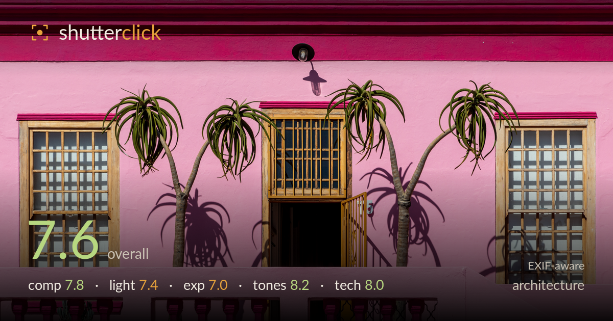
Palm shadows on a pink facade
Photo by Dietmar Rabich

| Focal length | 105 mm |
| Aperture | f / 14.0 |
| Shutter | 1/250 s |
| ISO | ISO 160 |
| Exp. comp. | 0.0 EV |
| Shot at | 08:09 · Mar 2, 2024 |
A confidently symmetrical facade study where the palm shadows do the real work, throwing graphic silhouettes across a saturated pink wall. The frontal, level framing suits the subject and the flanking windows balance the central doorway well. What most holds it back is highlight control: the pink wall pushes toward clipping in the brightest patches, and the interior doorway falls to near-black. The two palm trunks add welcome organic disruption to the geometry. Colour is the strongest asset here — the magenta balustrade against pink and warm timber is bold and coherent. Tighter highlight recovery would lift this further.
The frontal, symmetrical arrangement is well handled — the central doorway anchors two balanced windows, and the balustrade forms a strong horizontal base. The two palm trunks break the rigid geometry and lead the eye upward, their shadows adding a secondary layer of interest across the wall. Verticals are clean and level. The lamp at top centre is a nice anchoring detail. The crop feels slightly tight at the top edge where the lamp nearly touches the pink band; a touch more breathing room above would settle the frame.
Hard midday sun is the engine of this image, casting the crisp palm silhouettes that make the composition sing against the flat wall. That said, direct overhead light also flattens the facade's surface texture and renders the pink at high intensity with little modelling. The shadows are the payoff and they are well placed, but the harshness leaves the timber window frames slightly washed and the doorway interior in deep shadow. Lower, raking light would reveal the stucco texture, though it would sacrifice the graphic shadow play.
Exposure is largely controlled but the brightest pink patches on the wall edge toward clipping, losing subtle tonal variation in the paint. The interior of the doorway sits at near-black with no recoverable detail, which reads as intentional given the bright surround but removes any sense of depth inside. The window glass holds reasonable detail. A slight negative exposure compensation, or a raw pull on the highlights, would preserve gradation in the pink and keep the wall from feeling like a solid block of colour.
Colour is the standout. The layered pinks — hot magenta trim, softer body pink, and the vivid balustrade — are handled coherently without turning garish, and the warm timber frames provide a grounding contrast. White balance is neutral and the greens of the palms read naturally against the dominant pink. Contrast is strong thanks to the hard shadows. The overall grade feels faithful to the bold Bo-Kaap palette rather than over-pushed. The only risk is the pink verging on oversaturation in the brightest zones, where hue detail thins out.
The settings are well matched to the subject. At 105mm the perspective is compressed and flat, which keeps the verticals clean and avoids the keystoning a wider lens would introduce from this frontal position — a smart lens choice for a facade study. f/14 delivers front-to-back sharpness across the wall plane, appropriate here since the whole facade is the subject and no shallow separation is needed, while still sitting short of the diffraction softening that f/22 would bring. ISO 160 keeps noise negligible and 1/250s is more than enough to freeze a static building and the still palm fronds. Focus sits accurately on the wall plane and detail in the window mullions and balustrade is crisp. The execution is technically clean throughout; the only refinement would be metering slightly for the highlights to protect the pink, since the sensor's dynamic range was pushed by the bright wall against the black doorway.
What would elevate it
Tags
Shot something like this?
Expert photo critique, on demand — scored across six categories, EXIF-aware. Start with 3 free critiques, no credit card.
critique my photo — free