Parched cracked earth
Photo by Pexels

No EXIF metadata in this file
Technical analysis based on visual assessment only.
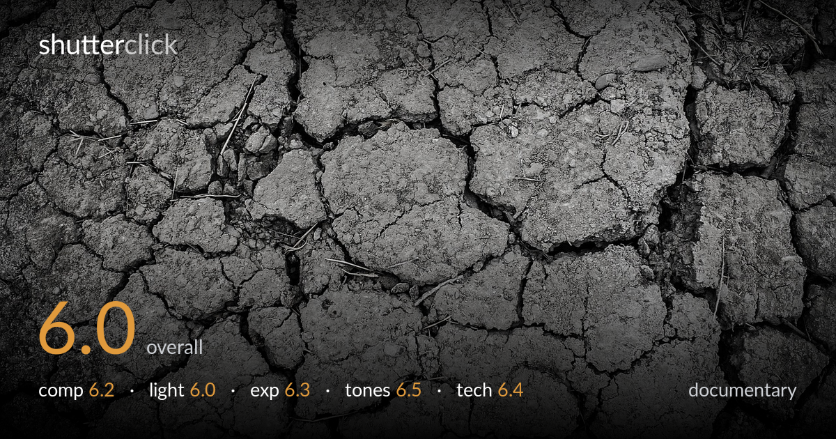
A clean, well-executed texture study of cracked, drought-dried earth that reads more as abstract pattern than documentary statement. The fissure network fills the frame edge to edge and the monochrome treatment suits the parched, lifeless subject. What holds it back is narrative: as documentary, the frame lacks context, scale, or human reference that would tell a drought story rather than simply show a surface. The flat overhead light keeps the crack depth muted, and the heavy vignette feels applied rather than earned. As a graphic abstract it works; as documentary it needs a wider environmental anchor.
The top-down framing fills the frame with the crack network, and the irregular polygons create a satisfying all-over pattern with no dead zones. There's no single anchor or focal point, which is fine for a texture study but weakens it as documentary — the eye wanders without a destination. The scattered straw fragments offer small accents but aren't placed deliberately. A diagonal crack or a varied scale element could give the grid more directional energy and stop the composition reading as uniformly even across the frame.
The light is soft and near-frontal, likely overcast or diffuse, which renders the surface evenly but flattens the crack depth. The fissures want raking, low-angle light to throw shadow into their gaps and reveal how deep and dry the ground really is. As shot, the cracks read as lines rather than crevices, and the texture of the crumbling soil stays muted. The even illumination keeps detail consistent but sacrifices the three-dimensional drama the subject is built for.
Exposure sits in a controlled mid-grey range with no significant clipping in the cracked surface, and shadow detail holds within the fissures. The histogram looks compressed toward the middle, which suits the dry, dusty mood but leaves the image feeling slightly flat. The corners are noticeably darkened by a vignette that crushes detail at the edges — this reads as a post addition rather than a natural falloff. A cleaner edge exposure would keep the whole surface legible.
The black-and-white conversion suits the parched subject and the grey tonal range conveys dryness well. Mid-tone gradation across the soil is decent, separating the raised plates from the recessed cracks. Contrast is moderate but could push harder to deepen the crack lines and add bite. The applied vignette darkens the corners aggressively, narrowing the tonal interest to the centre. Highlight roll-off is gentle and there's no harsh clipping, but the overall result feels a touch grey and could use more punch in the shadows.
Focus is accurate across the central plane and the surface detail is crisp where it matters, suggesting a sensible aperture choice for a flat, top-down subject where everything sits roughly on one plane. Depth of field is adequate — the whole surface stays acceptably sharp, which is the right call for a texture study. There's no visible motion blur, so the shutter handled the static subject cleanly, and noise is well controlled in the mid-tones. The main technical weakness is the heavy corner vignette, which crushes edge detail and looks like a post-processing addition rather than lens character. Sharpness falls off slightly at the frame edges, partly from that darkening. Holding the camera precisely parallel to the ground keeps the texture even and avoids any keystone distortion, which is handled well here. A focus check at the extreme corners and a lighter touch on the vignette would tighten the execution and keep the full surface legible.
What would elevate it
Tags
Shot something like this?
Expert photo critique, on demand — scored across six categories, EXIF-aware. Start with 3 free critiques, no credit card.
critique my photo — free