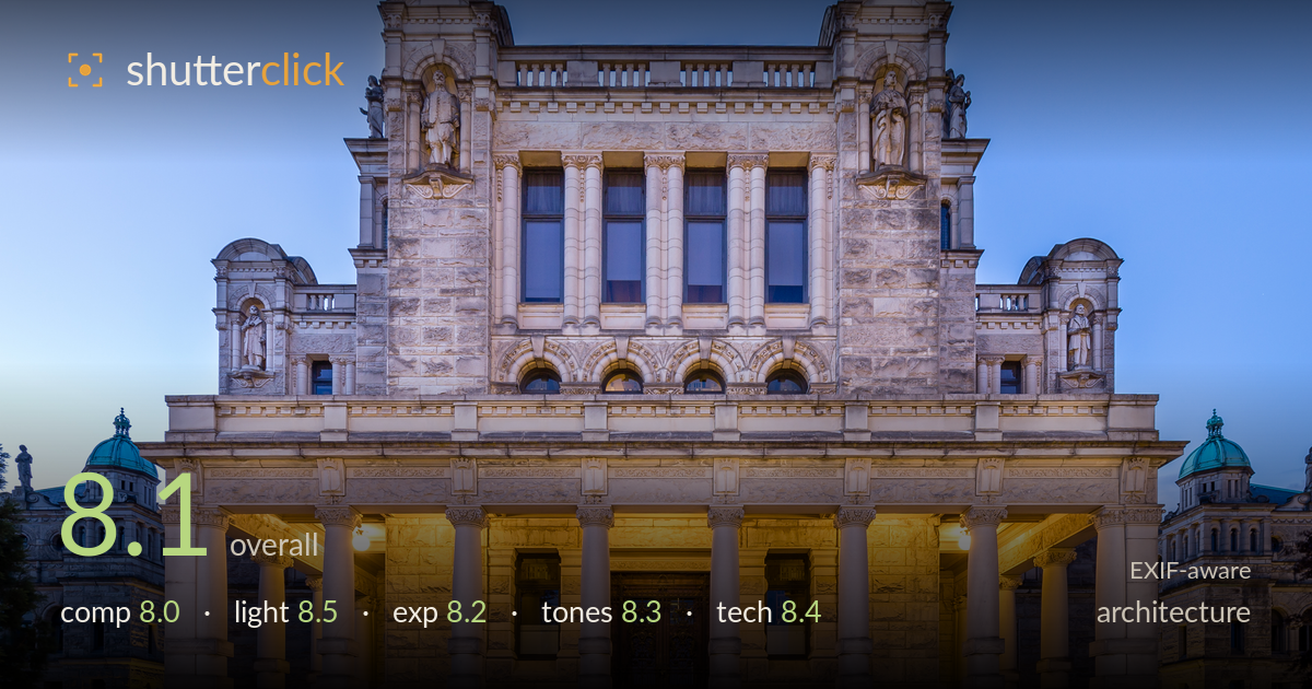
Parliament facade at blue hour
Photo by Michal Klajban

| Focal length | 16 mm |
| Aperture | f / 9.0 |
| Shutter | 10.0 s |
| ISO | ISO 100 |
| Exp. comp. | 0.0 EV |
| Shot at | 21:45 · Jun 10, 2018 |
A disciplined, symmetrical blue-hour study of a classical facade, and the balance of warm interior tungsten against cool twilight sky is the shot's strongest asset. The dead-centre framing suits the building's own axial symmetry, and the verticals are impressively true for a 16mm capture. What most holds it back is the foreground: the broad expanse of empty steps eats the lower third without adding depth or interest, and the frame clips the domed wings awkwardly on both edges. A tighter or repositioned crop and a touch more headroom would let the architecture breathe while keeping the geometry intact.
The centred, symmetrical framing is the right instinct for a building this axial, and the pediment sits cleanly in the upper frame. The main weakness is the lower third: a large stretch of empty steps dominates without adding depth or a leading element that draws the eye up to the entrance. The flanking wings are clipped mid-structure on both edges, leaving them looking amputated rather than deliberately cropped. Slightly more sky above the roofline would also relieve the crowded top edge.
The blue-hour timing is judged well and is the picture's real success. Warm tungsten glow pouring from behind the colonnade reads beautifully against the graduated cool of the twilight sky, giving the stone dimension and separating the portico from the facade above. The point lamps flanking the entrance add believable warmth without blowing out. Shadow rendering under the arches is soft and even, revealing carved detail rather than blocking up. Catching that narrow window where sky and artificial light balance is exactly what elevates this.
Exposure is well controlled across a demanding dynamic range. The bright tungsten interior holds without significant clipping, and the twilight sky retains smooth gradation from deeper blue up top to the paler band at the horizon. Shadow detail in the stonework and steps is preserved, showing texture rather than crushed black. The long exposure at ISO 100 keeps everything clean. If anything, the lamp hotspots flanking the door sit close to the highlight ceiling, but they remain within acceptable bounds for the mood.
The warm-cool colour contrast is the defining tonal choice, and the white balance is handled with restraint — the sky stays a natural twilight blue while the interior glow reads as honest tungsten rather than an oversaturated orange. Stone tones fall in a pleasing neutral range with subtle gradation. Contrast is well judged for the hour, keeping the mood soft without going flat. The saturation is tasteful throughout. The teal patina on the flanking domes adds a nice tonal accent against the warm core.
The settings are well matched to the task. At 16mm on the EF16-35 f/4L the lens is being used at its wide extreme, and f/9 is a sensible choice that keeps the facade sharp front to back while staying clear of heavy diffraction. ISO 100 with a 10-second exposure on a tripod delivers a clean, noise-free file with ample latitude, ideal for blue hour. Focus appears accurately placed across the building plane. The 16mm perspective inevitably stretches the near steps and edges, and while verticals have been kept commendably true — suggesting careful levelling or correction — the widest focal length is what forces the domed wings to clip at the frame edges. A step or two further back with a slightly longer focal length, if space allowed, would have eased the edge distortion and given cleaner treatment to the flanking structures without sacrificing the symmetry.
What would elevate it
Tags
Shot something like this?
Expert photo critique, on demand — scored across six categories, EXIF-aware. Start with 3 free critiques, no credit card.
critique my photo — free