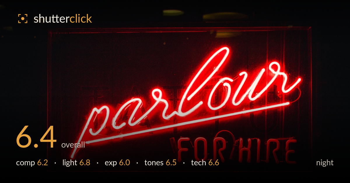
Parlour for hire in neon
Photo by StockSnap

No EXIF metadata in this file
Technical analysis based on visual assessment only.
A bold single-colour neon subject that reads instantly and sits confidently against a black surround. The most limiting factor is the near-total blowout of the brightest tubing — the script word and the underline core clip to pure white, sacrificing the neon's glow and colour where it matters most. Framing is a touch centred and slightly cramped at the sign's right and top edges, and faint ghost lettering behind the tubes competes for attention. The mood is strong and the colour is punchy; reining in the highlights and giving the sign a little more breathing room would lift a competent frame into a striking one.
The sign is placed almost dead-centre, which suits the graphic simplicity but leaves the framing feeling static. The upper and right edges crowd the sign's border, clipping breathing room and drawing the eye to the crop rather than the letters. The dark surround functions as effective negative space, isolating the subject well. The diagonal sweep of the script provides welcome energy against the horizontal 'FOR HIRE'. Faint background lettering behind the tubes introduces mild clutter that slightly muddies the read.
The neon is self-illuminating and provides all the light in the frame, which is handled with a clear sense of the subject's glow against darkness. The falloff into black is clean and gives the sign presence. The trouble is intensity: the brightest tubes overpower the sensor, flattening the light into a hard white line rather than the layered red-to-white gradient neon naturally produces. Slightly less exposure would let the coloured halo and reflected spill build atmosphere instead of burning out.
The exposure is pushed too far into the highlights. The script word and the underline stroke clip to pure white, losing all tube colour and the delicate glow that makes neon read as neon. The deep blacks are intentional and hold well, so dynamic range is used to isolate the subject, but the choice biases toward the shadows at the expense of the very highlights the image is built around. A stop less would recover the core colour without muddying the background.
The monochromatic red palette is committed and atmospheric, and the white balance keeps the surrounding black neutral and clean. Saturation in the mid-brightness tubing is rich and convincing. Where the tones break down is in the clipped whites, which read colourless and interrupt the otherwise smooth red gradient. The transition from glowing red to hot white is abrupt rather than graduated. A more controlled highlight would restore the tonal roll-off that gives neon its characteristic depth and warmth.
Focus sits accurately on the near tubing, and the letters are crisp enough to read every stroke, which is the priority here. Noise is well controlled in the black surround with no obvious colour speckle, suggesting a sensible ISO for the conditions. Depth of field appears sufficient to keep the whole sign plane sharp, appropriate for a flat subject. The principal technical shortfall is the handling of the light source's dynamic range — the brightest tubes are blown to paper white, which no amount of sharpness compensates for. This is an exposure-metering issue as much as a capture one: metering for the highlights, or bracketing and blending, would hold detail across the full brightness range. The framing crops the sign's border tightly, which reads as a slight compositional-technical miss rather than a deliberate edge. Overall execution is clean and competent, held back mainly by highlight control rather than focus, noise, or sharpness.
What would elevate it
Tags
Shot something like this?
Expert photo critique, on demand — scored across six categories, EXIF-aware. Start with 3 free critiques, no credit card.
critique my photo — free