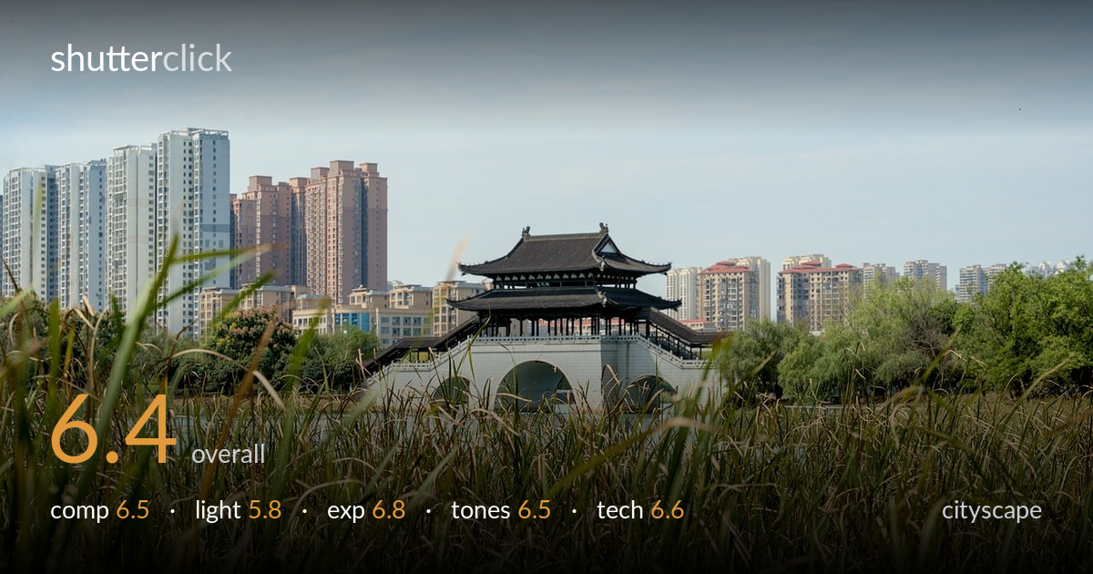
Pavilion bridge before the city skyline
Photo by smartschwarz

No EXIF metadata in this file
Technical analysis based on visual assessment only.
The layered juxtaposition of a traditional pavilion bridge against a modern high-rise skyline is the photo's strongest idea, and the wetland reeds in the foreground frame it with a clear old-versus-new narrative. What holds it back is flat midday light that leaves the scene low in contrast and atmosphere, and a foreground that occupies too much of the frame while drifting out of focus. The pavilion — the obvious anchor — sits centred and slightly small. Tighter intent on the focal plane and a stronger time of day would lift this from a pleasant record to a memorable cityscape.
The three-tier layering — reeds, pavilion bridge, skyline — sets up a strong old-versus-new contrast, and the pavilion is reasonably well placed near a thirds intersection. The reeds, though, claim more than half the frame and read as a heavy, undifferentiated mass rather than a deliberate foil. The pavilion ends up small for its narrative importance. A higher vantage or a tighter framing that gave the reeds a supporting role rather than the lead would balance the layers and let the bridge carry the eye.
Flat, high-sun midday light is the main limitation here. It leaves the pavilion's intricate rooflines and the skyline blocks without the modelling that raking light would bring, and the overall scene feels low in contrast and atmosphere. The hazy sky adds little. Side light from a lower sun — early morning or late afternoon — would carve shadow into the architecture and give the reeds dimensional sparkle rather than the even, slightly muted rendering they have now.
Exposure is handled competently. Highlights in the pale bridge stonework and the bright sky hold without obvious clipping, and shadow detail survives in the dark pavilion roof and the high-rise facades. The histogram looks balanced for a bright scene, with no accidental crushing. The image sits slightly bright overall, which combined with the haze flattens the midtones a touch; a small contrast or black-point adjustment would add the punch the light didn't provide.
The palette is natural and pleasant — green reeds, warm stone, muted skyline pastels under a soft blue sky. White balance reads accurate. The weakness is a general lack of tonal separation: the hazy atmosphere mutes the distant buildings and the whole frame leans toward low contrast. A gentle contrast lift and a touch of dehaze would deepen the sky and let the architectural colours register more distinctly without tipping into oversaturation.
Visual evidence points to a moderate telephoto compression that nicely stacks the pavilion against the skyline, pulling the distant city closer to the foreground reeds. Focus, however, lands awkwardly: the pavilion bridge is acceptably sharp but the nearest reeds are soft and the transition between near and far isn't cleanly resolved, suggesting the focal plane sat between subjects rather than locked on the architecture. A smaller aperture would have extended depth of field to carry both the reeds and the bridge, or a focal point firmly on the pavilion with the reeds rendered as a deliberate soft frame would have read as more intentional. Noise is well controlled and there's no motion blur, so the shutter and ISO appear suitable for the bright conditions. The core fix is decisiveness about what should be sharp: committing the focus to the pavilion and stopping down enough to keep the foreground legible would resolve the slightly indecisive plane this image now carries.
What would elevate it
Tags
Shot something like this?
Expert photo critique, on demand — scored across six categories, EXIF-aware. Start with 3 free critiques, no credit card.
critique my photo — free