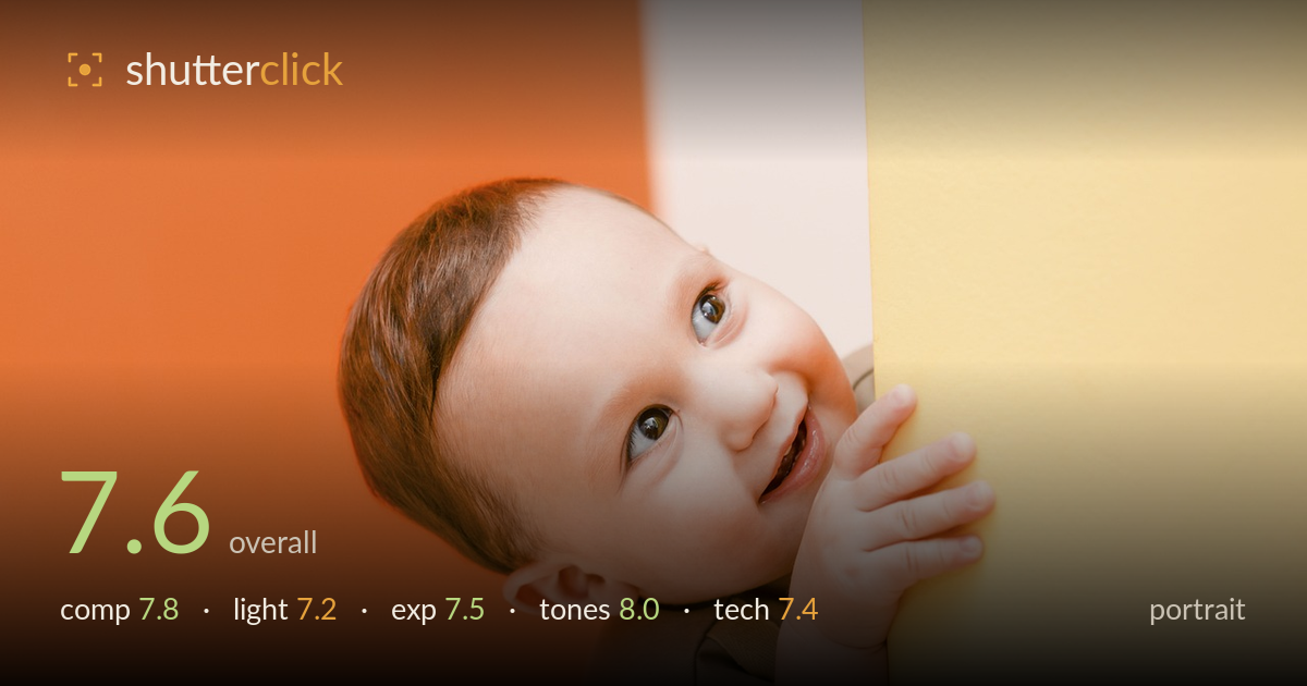
Peeking around the corner
Photo by StockSnap

No EXIF metadata in this file
Technical analysis based on visual assessment only.
A charming candid portrait carried by genuine expression and a bold, complementary colour block of orange and yellow. The child peeking around the wall with an upward glance and grabbing hand reads as authentic and full of life, and the eyes are sharp and lively with clear catchlights. What holds it back most is the tight right-edge placement — the subject is pressed hard against the yellow wall with the hand almost touching the frame edge, leaving a large expanse of empty orange on the left that isn't quite balanced by anything. Slightly cooler, more even light on the shaded side of the face would add polish, but the moment itself is the real win.
The peek-around-the-corner framing is inventive and the diagonal wall edge creates a natural leading line into the face. The upward gaze and gripping hand build a sense of anticipation. However, the subject sits very tight to the right edge, with the hand nearly clipped, while the left half is a broad, empty orange field. That negative space suits the playful mood but tips slightly toward imbalance. A touch more breathing room on the right and a marginally tighter left crop would settle the weight and stop the hand feeling pinched.
Soft, diffuse light keeps skin smooth and flattering, with attractive catchlights that give the eyes life. The direction is largely frontal and even, which is gentle but a little flat — the shaded left side of the face and the ear fall into muted shadow without much modelling. A slightly more directional key, or a subtle fill bounced back from the left, would sculpt the cheekbone and forehead and add dimension. The bright yellow wall usefully kicks warm light back onto the hand and cheek.
Exposure is well judged for a high-key, colourful scene. Skin tones sit at a pleasing brightness with detail retained across the face and hand, and the highlights on the yellow wall stay controlled rather than blowing out. The shadow side of the face and the darker hair hold enough detail without muddiness. Nothing looks clipped in a distracting way. The overall reading is a touch bright, which flatters the cheerful mood, though a hair more midtone contrast on the face would give it a little more punch.
The colour work is the standout — the orange and yellow blocks form a confident complementary palette that frames the warm skin tones beautifully. White balance is pleasantly warm and consistent, keeping the child's complexion natural against saturated surroundings. Contrast is soft in keeping with the bright, airy treatment, and saturation is bold without tipping into garishness. The reddish hair sits harmoniously within the warm scheme. If anything, the palette runs almost entirely warm; a cooler accent somewhere would add tension, but the cohesion here is a genuine strength.
Focus lands accurately on the eyes, which are crisp and detailed with visible texture in the iris — exactly where sharpness needs to be for a portrait. The depth of field is shallow enough to soften the background walls into clean colour fields while keeping the whole face and the grasping hand within acceptable focus, suggesting a well-chosen aperture and distance. There is no visible motion blur despite the candid, active pose, so shutter speed was sufficient. Noise is well controlled and the image is clean throughout. The rendering of skin is smooth without looking over-processed. The main technical limitation is the frontal, flat light already noted, and the very tight right-edge framing that risks clipping the hand — both are choices rather than faults. Overall execution is solid and dependable, delivering a sharp, clean file that captures a fleeting expression without technical distractions. A slightly faster continuous burst approach would help lock the exact peak of a wriggling toddler's expression.
What would elevate it
Tags
Shot something like this?
Expert photo critique, on demand — scored across six categories, EXIF-aware. Start with 3 free critiques, no credit card.
critique my photo — free