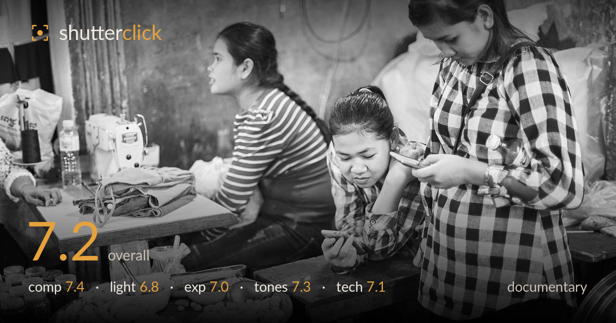
Phones and pattern at the market stall
Photo by Engin_Akyurt

No EXIF metadata in this file
Technical analysis based on visual assessment only.
A layered slice of daily life that balances contemporary distraction against a working market setting — two young women absorbed in phones while a third talks past the frame, with sewing machines and prepared food anchoring the context. The three-figure structure builds real narrative depth. What most holds it back is the foreground: the tray of food and jars occupy significant space but compete rather than complete, and the mixed ambient light flattens some faces. Tightening the environmental storytelling and cleaning the lower edge would let the human moment breathe. The black-and-white treatment suits the scene and the tonal range is honest.
The staggered depth works well — the standing woman on the right, the seated phone-user in the middle, and the striped-shirt figure turned away build three planes of story. The food tray and jars ground the setting in the market economy. However, the lower foreground carries a lot of visual weight without clear purpose, and the right-standing figure is cropped through the hip, cutting her off awkwardly. A touch more room on the right or a lower angle would integrate her more naturally into the scene.
The available ambient light is soft and diffuse, typical of an interior market stall, and it renders skin and fabric texture reasonably. The bare bulb visible top-centre hints at the source but doesn't dominate. Direction is largely flat and frontal, so the faces lack the modelling that raking light would give — the middle woman's downturned face falls into muted mid-tones. The pattern-heavy clothing does much of the visual heavy lifting that light might otherwise provide. Timing and placement are documentary-honest rather than shaped.
Exposure is well controlled for a mixed-light interior. Highlights on the white checks and the ceramic bowls hold detail without clipping, and shadow areas in the background wall retain gradation rather than blocking up. The overall balance leans slightly bright, which keeps the busy background readable. Faces sit at a workable mid-tone. Nothing looks accidental here — the brightness reads as a deliberate choice to preserve the environmental detail that makes the frame work as reportage.
The monochrome conversion suits the subject, drawing the eye to the graphic clash of stripes and checks rather than colour distraction. Contrast is moderate and honest, with a full tonal range from the dark jars in the lower left to the bright shirt. Mid-tone separation on the faces could be slightly stronger — some skin tones sit close to the wall values behind them. Highlight roll-off on the white fabrics is clean. A modest contrast lift would add snap without sacrificing the reportage authenticity.
Focus appears to land on the middle woman and her phone, which is the correct choice for the emotional centre of the frame — her expression carries the story. The depth of field is deep enough to keep all three figures and the food tray acceptably sharp, appropriate for an environmental documentary frame where context matters as much as subject. There's no obvious motion blur despite the interior light, suggesting a shutter speed fast enough for the near-static poses, and noise is well managed for what was likely a higher ISO situation. The wide framing captures the scene without visible distortion problems. The one execution concern is the crop on the right figure, which reads as a framing decision under pressure rather than gear limitation. Overall the technical handling is solid and unobtrusive, letting the moment come through — exactly the right priority for reportage where polish serves story rather than the reverse.
What would elevate it
Tags
Shot something like this?
Expert photo critique, on demand — scored across six categories, EXIF-aware. Start with 3 free critiques, no credit card.
critique my photo — free