Photographing the public market sign
Photo by StockSnap

No EXIF metadata in this file
Technical analysis based on visual assessment only.
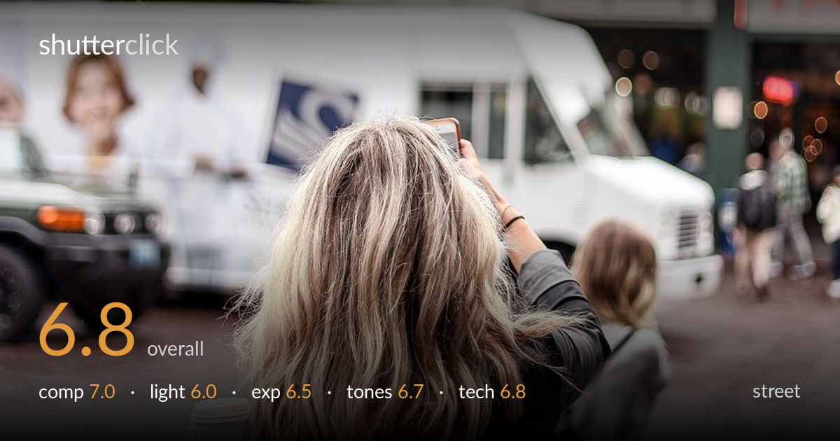
A clean tourist vignette that works on the strength of its layering — the back-turned woman raising her phone toward the famous Pike Place sign creates an immediate, readable story. The repeated gesture of the second woman echoes it nicely. What most holds the frame back is the flat, overcast light and a blown white sky that drains the upper third of energy, plus the strong red sign competing for attention against muted everyday colour. The moment is good and the depth is genuine; tighter timing and a touch more contrast would push it from a competent observation toward a memorable one.
Strong layered depth: foreground figure, midground truck and second woman, and the landmark signage behind. The back-of-head framing is a familiar but effective device for placing the viewer in the scene. The subject sits slightly left and low, leaving the bold sign to anchor the top — a workable balance. The delivery truck is a bit of a visual block across the midground, and the second woman is partly cut by the frame edge, which weakens the echoing-gesture relationship. A hair more space on the right would have let that secondary figure breathe.
Flat, diffuse overcast light dominates, which suits candid street shooting in that it avoids harsh shadows and keeps the cobblestones and faces evenly lit. The downside is that nothing is shaped — the scene reads soft and low in dimension, and the neon sign has no glow to play with. Directional light or a break in the cloud would have lent the red lettering and the hair some modelling. As shot, the light is serviceable and honest but contributes little drama or mood of its own.
Generally well managed for a bright overcast day. The foreground figure, coffee cup and cobblestones hold good detail, and shadow areas in the dark jacket and backpack retain texture rather than crushing. The clear weakness is the sky, which is fully blown to paper white behind the signage — some of that is unavoidable in flat conditions, but a third of a stop down would have preserved a hint of cloud and helped the red letters separate. Midtones across the brick and clothing are placed sensibly.
The red of the signage is the dominant colour event, and it carries the frame against an otherwise muted palette of greys, blacks and warm brick. White balance reads neutral, perhaps a touch cool, which fits the overcast feel. Contrast is on the low side, leaving the image slightly flat overall — the blown sky compounds this. The brick tones are pleasantly warm and give the lower half its grounding. A modest contrast and clarity lift would add the snap the diffuse light denies.
Focus appears to land on the foreground woman's hair and shoulders, which is the right call, while the background sign and second figure fall into gentle softness — a depth-of-field choice that reads as a moderately wide aperture and helps separate the subject. The signage being soft is borderline, though, since it carries much of the story; a slightly deeper depth of field would have kept the lettering crisp without sacrificing the layered look. Sharpness on the hair and the coffee cup is adequate rather than crisp, suggesting either a marginal shutter speed for the handheld framing or minor focus drift. Noise is well controlled in the flat daylight. The vertical orientation suits the tall sign and the standing figures, and the framing handles the busy scene without clutter. Overall execution is competent and stable; the main technical lever to pull is securing critical sharpness on whichever plane is meant to read as the point of interest.
what would elevate it
tags
Shot something like this?
Expert photo critique, on demand — scored across six categories, EXIF-aware. Start with 3 free critiques, no credit card.
critique my photo — free