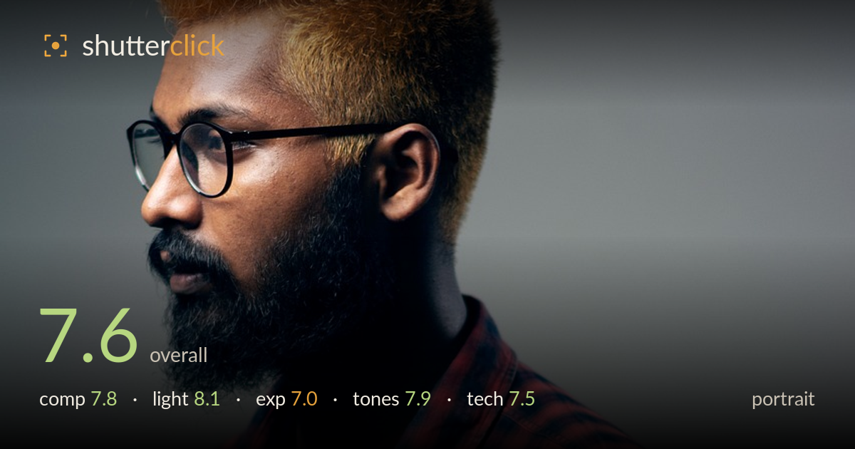
Profile in warm side light
Photo by kaziminmizan

No EXIF metadata in this file
Technical analysis based on visual assessment only.
A well-lit profile portrait that leans on strong side light and a graphic colour story — bleached hair, plaid shirt, and a neutral grey backdrop that all read as deliberate. The rim of light along the hair and cheek gives the head sculptural presence. What most holds it back is the near-full-profile pose combined with the gaze running hard into the right frame edge: the subject looks almost pinned against the wall, and the eye has little room to travel. Slightly deeper shadow detail and a touch more breathing space in the look direction would lift this from competent studio work toward something more considered.
The subject sits low and centre-right, with a clean sweep of grey negative space filling the upper background. The profile pose is graphic and the head-to-frame proportions are comfortable. The weakness is look direction: the gaze runs straight into the right edge with almost no room ahead of it, creating a slightly cramped, hemmed-in feeling. Placing the subject further left to open space in front of the face would resolve the tension. The tight bottom crop through the torso also reads a touch arbitrary.
Directional side light does the heavy lifting here, raking across the hair and catching the edge of the cheek and beard to separate the head from the grey. The falloff into shadow on the near side of the face is handled with restraint and gives real dimensionality. A gentle background gradient adds depth without distraction. The one cost is that the eye and glasses sit in the shadowed side, losing a catchlight and some engagement — a subtle fill or reflector on the shadow side would recover facial detail without flattening the mood.
Overall brightness is judged for mood, keeping the shadow side of the face and beard deep while protecting the lit hair highlights, which sit right at the edge without clipping harshly. The plaid shirt retains pattern detail across most of its range. The trade-off is that the shadowed eye and near cheek fall quite dark, sacrificing readable detail where a portrait most needs it. Lifting the deepest facial shadows a stop in post, or adding a hair of fill, would keep the drama while restoring information.
The colour story is the strongest element: warm coppery hair against cool grey, tied together by the red-and-navy plaid. White balance leans slightly warm, which flatters skin and hair without going orange. Contrast is punchy but controlled, and the grey backdrop stays clean and neutral. The plaid holds saturation without blocking up. If anything, the shadow tones on the face verge on muddy rather than richly deep — a touch more separation in the darkest skin values would keep the low end from feeling flat.
Focus appears placed on the glasses and near eye, which is the correct plane for a profile, and detail in the beard and hair texture is crisp. Depth of field looks moderate — the shirt stays largely sharp while the background falls softly out, suggesting a sensible aperture for the working distance. Noise is well controlled and the grey backdrop stays clean, pointing to a low ISO and controlled studio light. The lens choice avoids obvious distortion and renders the profile with natural proportions. The main technical concern is the shadow side of the face rendering with limited detail, which is more a lighting-ratio and exposure decision than a focus or gear fault. Micro-contrast in the lit hair is excellent. A slightly wider depth of field is unnecessary here; the current rendering suits the subject. Nothing in execution undercuts the image — the shortfalls are creative choices about ratio and framing rather than errors of craft.
What would elevate it
Tags
Shot something like this?
Expert photo critique, on demand — scored across six categories, EXIF-aware. Start with 3 free critiques, no credit card.
critique my photo — free