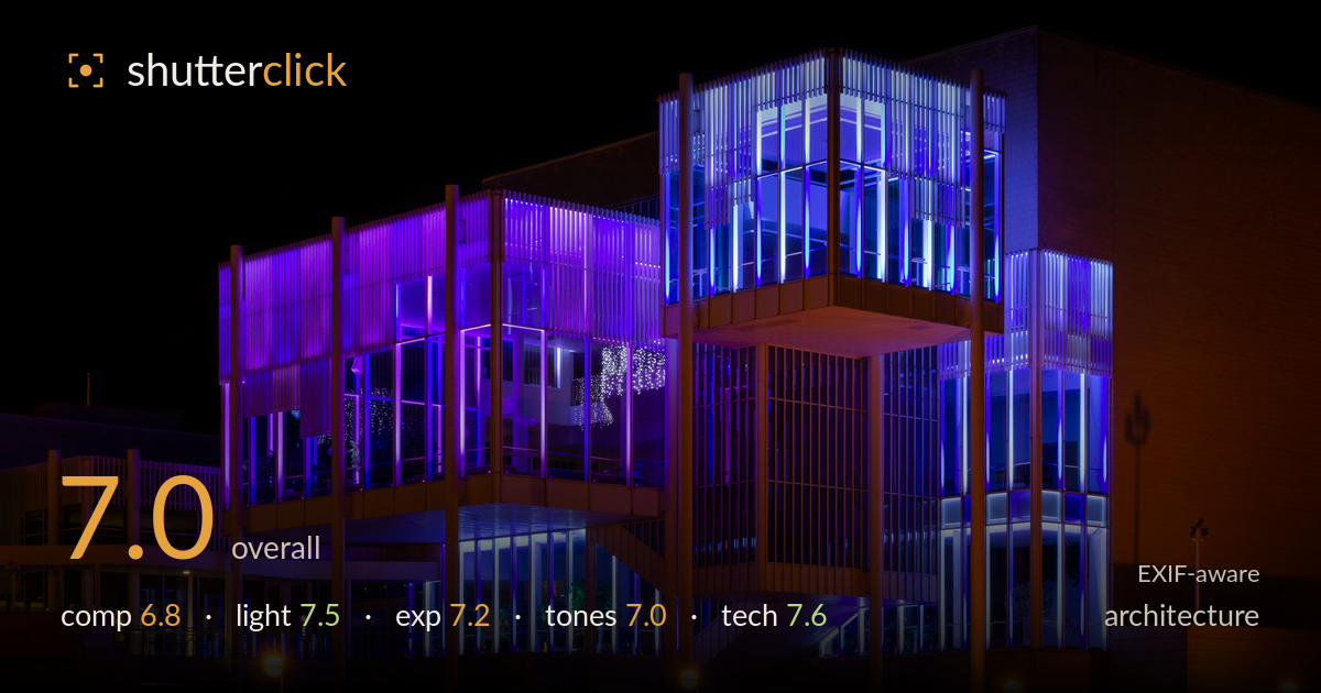
Purple and blue lit facade at night
Photo by Markus Säynevirta

| Focal length | 40 mm |
| Aperture | f / 14.0 |
| Shutter | 8.0 s |
| ISO | ISO 100 |
| Exp. comp. | 0.0 EV |
| Shot at | 00:13 · Dec 13, 2018 |
A confident night study of an illuminated modernist building, carried by the strong purple-to-blue LED gradient against a clean black sky. The verticals of the fins and columns are handled well and the exposure holds interior detail without blowing the coloured light. What most holds it back is the flat, near-frontal viewpoint that lets the two lit blocks compete rather than build a hierarchy, and the empty foreground of bare ground and lampposts that adds little. A more resolved angle and tighter framing would let the architecture's geometry, which is genuinely striking, read with more intent.
The building's stacked, offset volumes are the strong graphic element, and the vertical fins repeat cleanly across the frame. The verticals stay reasonably true, which matters here. But the near-symmetrical frontal view flattens the depth, and the bright blue tower on the right competes with the purple block on the left for attention with no clear resolution. The lower third is mostly dead foreground — bare ground, scattered lampposts — that adds weight without interest. Cropping up or shooting from a three-quarter angle would give the geometry more thrust.
The artificial LED lighting is the whole show and it delivers: the purple-to-blue wash sculpts the glass and fin structure well, and the warm sodium lampposts provide a pleasing complementary counterpoint. The interior glow reveals structure without flaring. The dark sky is a clean backdrop that isolates the lit volumes. The main limitation is that the lighting is entirely as-found — there is no shaping choice beyond timing — so the two coloured masses read at similar intensity and fight for dominance rather than one leading.
The 8-second exposure at ISO 100 is well judged for the scene. The vivid blues and purples retain saturation and detail rather than clipping into flat blocks, which is easy to lose with LED sources. Shadow areas fall to true black in the sky without crushing the building itself, and interior highlights hold. The warm lamp globes are near their limit but not distractingly blown. Overall a deliberate, controlled exposure that uses the dynamic range of the scene sensibly across a difficult mixed-source situation.
The complementary palette of cool violet-blue against warm amber is the tonal strength here, and the contrast against the black sky is clean. White balance reads believable for mixed LED and sodium sources. Where it slips slightly is in the transition zone where purple and blue meet on the central tower — the two hues muddy rather than resolve, and some of the warm-lit stone edges toward a flat orange. Slightly more separation between the two cool tones would sharpen the read without losing the drama.
The settings are well matched to the task. ISO 100 with an 8-second shutter on a tripod is the right approach for a static night subject, keeping noise negligible and giving clean shadows. f/14 delivers front-to-back sharpness across the building's depth, and at 40mm on this body the perspective stays fairly natural without heavy distortion, keeping verticals close to true. Focus appears accurate across the illuminated planes. The one caution is that f/14 on this sensor pushes into diffraction territory — around f/8 to f/11 would likely have preserved a touch more critical fin detail with no real depth-of-field penalty given the subject distance. The long exposure has captured the LED colour cleanly without motion artefacts. Technically this is a solid, well-executed night capture; the execution is more assured than the framing. A remote release or mirror lock-up, if not already used, would guard against any residual softness at these shutter speeds.
What would elevate it
Tags
Shot something like this?
Expert photo critique, on demand — scored across six categories, EXIF-aware. Start with 3 free critiques, no credit card.
critique my photo — free