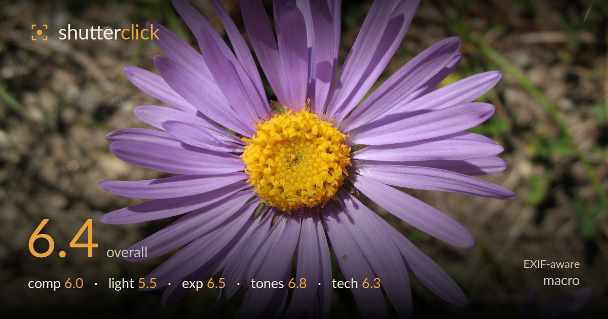
Purple aster in the sun
Photo by Andrew Bossi

| Focal length | 7 mm |
| Aperture | f / 4.0 |
| Shutter | 1/800 s |
| Exp. comp. | 0.0 EV |
| Shot at | 12:08 · Jul 15, 2007 |
A clean, radially symmetric aster rendered with pleasing petal detail and a strong colour relationship between lilac rays and the golden disc. What most holds it back is the hard midday sun: the light is flat and top-heavy, throwing distracting petal shadows across the bloom and blowing small highlight patches. The centring is safe rather than dynamic, and a second flower intrudes at the bottom-right corner. The disc florets are sharp and textured, which is the real reward here. Softer, more directional light and a cleaner corner would elevate this from a good record shot to a compelling macro.
The bloom is placed dead-centre, which suits the radial symmetry but leaves the frame static and predictable. The disc reads clearly as the focal point and the petals fan out evenly. The busy earth-and-grass background competes for attention rather than receding cleanly, and a second flower crops awkwardly into the lower-right corner — a genuine distraction that pulls the eye off the main subject. Placing the disc slightly off-centre, or angling in to break the flat frontal symmetry, would add tension the head-on view lacks.
This is the weakest element. Hard, high midday sun lights the flower frontally and from above, producing petal shadows that fall across neighbouring petals and clutter the form. The light is even but unmodulated — it describes the subject without shaping it, and the harsh quality flattens the delicate petal translucency that softer light would reveal. A few small specular highlights on the disc are close to clipping. Overcast light, or a diffuser held over the bloom, would tame the contrast and let the lilac tones glow.
Overall brightness is well judged — the lilac petals hold their delicate value without going chalky, and the yellow disc retains texture rather than smearing into a solid mass. A handful of specular points on the disc florets nudge toward clipping under the hard sun, but nothing large is lost. Shadow areas in the background keep detail. The 0 EV choice works for this evenly lit subject; a touch of negative compensation would have protected those brightest disc highlights while costing nothing in the darker earth tones.
The lilac-to-yellow complementary pairing is the image's strongest asset, and white balance under direct sun renders both colours believably without a cast. Petal saturation is natural, and there is gentle gradation across the rays from base to tip. Contrast runs a little high courtesy of the hard light, clipping some petal separation into the shadows. The muddy brown-and-green background dulls the overall palette. Slightly lifting shadows and easing global contrast would restore petal-to-petal separation and let the flower's colour carry more cleanly.
The small-sensor PowerShot at f/4 and 7mm delivers deep depth of field, so the entire flower head sits acceptably sharp — sensible for capturing the disc florets, which show good fine texture. The 1/800s shutter easily freezes any breeze, and base ISO keeps noise negligible. Focus lands correctly on the disc centre, the right choice. The trade-off is that this compact camera and short focal length can't throw the background meaningfully out of focus, so the cluttered ground stays too legible and the corner flower reads sharply enough to distract. This is a genuine limitation of the gear rather than execution. Getting physically closer, or shooting at a lower angle to place more distance behind the bloom, would help the background fall away despite the deep native depth of field. Overall the settings are well matched to the subject; the constraint is the fixed compact optics, not the choices made with them.
What would elevate it
Tags
Shot something like this?
Expert photo critique, on demand — scored across six categories, EXIF-aware. Start with 3 free critiques, no credit card.
critique my photo — free