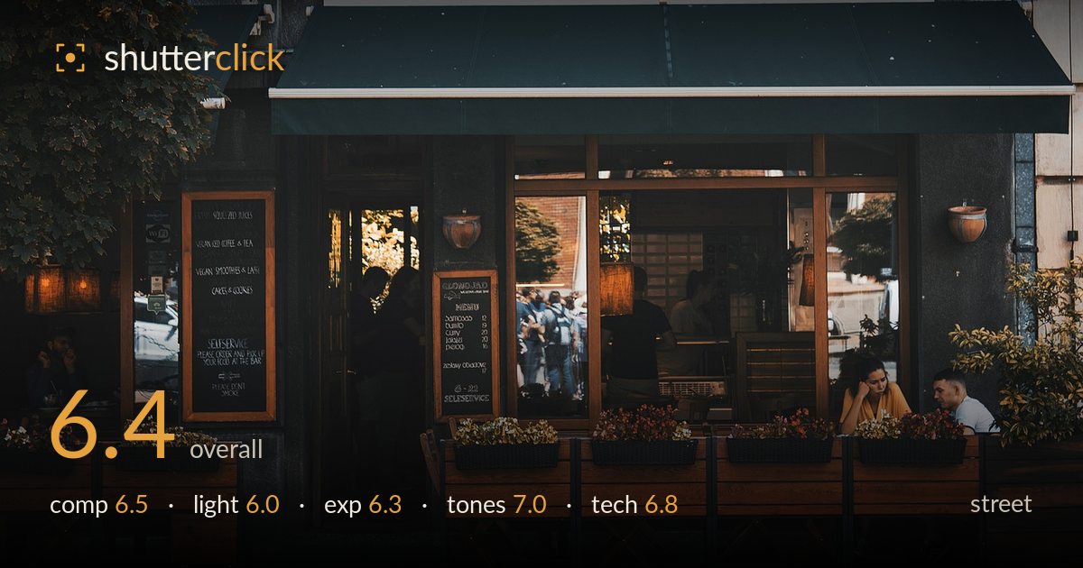
Quiet afternoon at the vegetarian bar
Photo by DimaLiss

No EXIF metadata in this file
Technical analysis based on visual assessment only.
A well-observed storefront frame with strong environmental character, but the human moment is undersized and stranded in the far right corner. The GLONOJAD signage, green awning, and warm wooden terrace read as a coherent, atmospheric scene, and the layering of reflections and interior figures adds depth. What holds it back is the lack of a decisive moment — the couple at right is the only real human interest and they compete with a lot of empty terrace furniture. The frame documents a place more than it captures a moment. Tightening the relationship between people and setting would lift it.
The frontal, architectural framing gives the signage and awning a clean, balanced presence, and the wooden planters form a strong horizontal base. The problem is subject placement: the only animated human element — the seated couple — sits jammed against the right edge, weakened by cropping and easily missed. The left third is filled with a dark bench and menu boards that carry little weight. The reflected pedestrians in the glass add welcome life but read as clutter rather than a deliberate layer. A framing that gave the couple more room would sharpen the intent.
Soft, flat, overcast light suits the muted mood and keeps the wood tones and green awning even, but it offers little modelling or direction. The interior glows warmly against the cooler exterior, a nice contrast that hints at depth, yet nothing in the frame is sculpted by light. The signage sits in shadow under the awning, dulling its impact. Directional or lower-angle late light would rake across the terrace wood and give the scene the dimensionality the flat conditions currently withhold.
Exposure is handled sensibly for a wide tonal range. Shadow areas under the awning and in the dark bench at left retain reasonable detail without blocking up, and the bright interior and reflections avoid harsh clipping. The overall rendering leans dark, which supports the mood but risks the left side reading as dead space. Midtones on the wooden terrace are well placed. A touch more shadow lift on the left would recover the menu board and balance the frame's weight.
The colour palette is the strongest element — muted teal awning, warm honey wood, and desaturated brick sit together in a cohesive, restrained grade. White balance is believable, with the warm interior playing nicely against the cooler street. Contrast is gentle and appropriate for the overcast, contemplative feel. The reds in the planter flowers add small accents without breaking the scheme. Tonal gradation across the wood is smooth. The overall treatment feels intentional and mature rather than accidental.
Focus appears accurate across the storefront plane, with the signage lettering, awning edge, and wooden slats all crisp, indicating a well-chosen aperture for this flat frontal subject. Depth of field is deep enough to hold both the terrace and the interior reflections in acceptable sharpness, which suits the documentary intent. Noise is well controlled in the shadow regions, suggesting a sensible ISO for the overcast conditions. The lens choice renders the geometry cleanly with minimal distortion, keeping verticals largely upright. Sharpness on the seated couple is slightly softer than the main plane, but not distractingly so. The main technical limitation is not execution but decision: everything is rendered evenly, so nothing is emphasised. A wider aperture to gently separate the couple from the background, or a longer focal length to isolate them, would have used technique to direct the eye. As executed, the craft is clean and competent but serves description rather than storytelling.
What would elevate it
Tags
Shot something like this?
Expert photo critique, on demand — scored across six categories, EXIF-aware. Start with 3 free critiques, no credit card.
critique my photo — free