Quiet cobblestone old town
Photo by Herrte

No EXIF metadata in this file
Technical analysis based on visual assessment only.
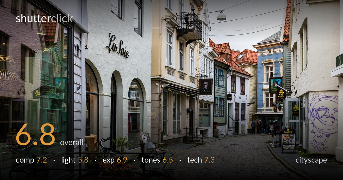
A well-observed European street scene that uses the cobblestone road as a strong receding line drawing the eye down through old timber facades toward distant figures. The framing is competent and the depth reads clearly. What most holds it back is the flat, overcast light, which mutes the architectural detail and leaves the whole frame low in contrast and energy. The foreground bicycle-and-flower-basket cluster is a nice anchor but sits slightly heavy and cluttered. With stronger light or a tighter compositional decision about the foreground, this would carry far more presence than its current pleasant-but-static state.
The cobblestone street works hard as a leading line, curving the eye from the foreground bicycles down to the small figures and bright signage in the distance — good use of depth. The left wall of facades layers nicely. The foreground bicycle and flower basket anchor the bottom-left, but the clutter of railings, A-frame signs and bins competes for attention without a clear hierarchy. The right edge feels heavier and busier than the left. A slightly lower angle would emphasise the cobbles more decisively.
Flat, diffuse overcast light dominates and is the weakest element here. It renders the colourful timber facades and red-tile roofs without modelling or directional shadow, flattening the architectural relief that gives such streets their character. There are no highlights or shadow play to add dimension. Soft light suits even tonal coverage and avoids blown skies, but here it drains the scene of mood. Shooting in low side-raking light, golden hour, or after rain when cobbles glisten would transform the same composition.
Exposure is handled sensibly given the flat conditions. The white sky is held just below clipping, retaining faint tone rather than blowing out entirely. Shadow detail in the recessed doorways and shop interiors is preserved, and the cobblestones sit in a clean midtone range with full texture. The histogram appears well centred with no aggressive crush or burn. The decisions read as deliberate and the dynamic range of the overcast scene is comfortably contained. Nothing is technically wrong here.
The colour rendering is naturalistic but subdued, a direct consequence of the grey light. White balance leans slightly cool, reinforcing the muted, damp atmosphere. The red roofs, ochre walls and blue facade provide welcome colour accents but lack vibrancy. Tonal range is compressed into the midtones with little deep shadow or bright highlight to give the image punch. A modest contrast lift and selective saturation on the warm roof tiles would add separation without looking artificial, while keeping the honest, overcast character intact.
Image quality is solid throughout. Focus appears accurately placed across the scene with good front-to-back sharpness, suggesting a sensible mid-range aperture that keeps both the foreground bicycle and the distant figures acceptably crisp — appropriate for a deep cityscape where everything should read. Noise is well controlled, consistent with shooting at a low ISO in adequate daylight. The wide-to-normal focal length captures the street's scale without obvious distortion, and verticals on the buildings are reasonably well controlled, with only minor convergence at the frame edges that a lens-correction pass could tidy. Detail holds up in the timber cladding and cobblestone texture. The slight reflections in the left shopfront glass add interest rather than distraction. There is no visible motion blur in the distant figures, indicating a shutter speed quick enough for the static scene. Overall execution is clean and dependable; the technical foundation is sound, leaving the creative variables — light and foreground management — as the real opportunities for elevation.
What would elevate it
Tags
Shot something like this?
Expert photo critique, on demand — scored across six categories, EXIF-aware. Start with 3 free critiques, no credit card.
critique my photo — free