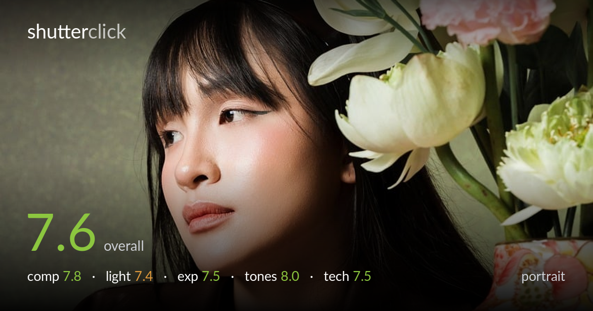
Quiet portrait among the flowers
Photo by Gốm_Sứ_Cương_Duyên

No EXIF metadata in this file
Technical analysis based on visual assessment only.
A well-styled editorial portrait where colour and prop coordination carry the frame — the warm browns of the leather jacket, the muted olive backdrop, and the bursts of floral colour build a cohesive, deliberate palette. The subject's averted gaze and relaxed pose read as quietly considered. What most holds the image back is the slightly soft rendering of the eyes, which a portrait this composed needs tack-sharp to anchor it, and the busy vase competing for attention at the edge. The light is flattering but a touch flat across the face. Strong styling, refined tones, just shy of fully resolved execution.
The diagonal of the folded arms and the leaning head create an easy resting line that guides the eye up to the face. Placing the subject left and the floral vase right balances the frame, and the loose flowers spilling across the top add an organic frame. The single fallen petal in the foreground is a thoughtful touch. The vase, however, is visually loud and competes with the face for attention. A slightly tighter framing or softer vase rendering would keep the subject dominant.
Soft, broad light wraps the face gently and renders the skin smoothly with a flattering falloff toward the jaw. The catchlights are faint, which slightly dulls the eyes' life. The lighting reads as even but somewhat flat — there's little directional shaping to model the cheekbones or add dimension. A touch more side or short lighting would carve more form into the face and deepen the mood. The flowers and vase catch the same soft light cleanly, keeping the scene consistent.
Exposure is well controlled across a tricky range. The dark leather jacket retains texture and stitching detail without blocking up, and the pale backdrop and tablecloth hold without blowing out. Skin tones sit at a pleasant, natural midtone. The white flowers at top keep just enough highlight detail. Nothing reads as clipped or muddy. The overall placement is comfortable and clearly deliberate, balancing the bright florals against the dark wardrobe without sacrificing either end of the tonal scale.
The colour grading is the standout. A muted olive-green background plays beautifully against warm browns, and the coral, pink, and yellow florals supply controlled pops without tipping into garish. White balance is accurate, with healthy, natural skin tones. Contrast is gentle, suiting the soft, editorial mood, and the warm undertone ties the whole palette together. The harmony between wardrobe, props, and backdrop shows genuine attention to colour relationships rather than a happy accident.
From the visual evidence the depth of field is moderate — the face and arms sit in acceptable focus while the flowers and vase fall slightly soft, suggesting a mid aperture that mostly holds the subject. The critical issue is that the eyes, where a portrait must be tack-sharp, look a touch soft; the sharpest plane appears to land closer to the cheek or jacket than the iris. Whether that's focus placement or a slightly long shutter on a leaning subject, locking focus on the near eye would lift the whole image. Noise is well managed and the skin renders cleanly without over-smoothing. The leather texture and the floral detail on the vase resolve nicely, indicating decent lens performance. Framing is steady and the perspective is natural for a seated portrait. Tightening focus on the eye and perhaps a slightly faster shutter to guard against subtle subject movement would close the gap between a good portrait and a sharp one.
what would elevate it
tags
Shot something like this?
Expert photo critique, on demand — scored across six categories, EXIF-aware. Start with 3 free critiques, no credit card.
critique my photo — free