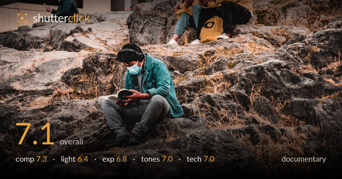
Quiet solitude on the rocks
Photo by Jeff_Ersoh

No EXIF metadata in this file
Technical analysis based on visual assessment only.
A quietly observed slice of pandemic-era public life, layering solitary figures across a rocky urban hillside — each absorbed in a phone, a book, a mask still on. The staggered placement of five people at different depths gives the frame genuine narrative reach: reading, scrolling, drinking, all disconnected yet sharing the same rock. The reading figure anchors it well. What most holds it back is flat, overcast light that mutes separation between subjects and the busy rock texture, and a warm colour grade that tips toward muddy in the mid-tones. The eye works to sort the layers because tonal contrast is low across the frame.
The staggered arrangement of figures across depth is the real strength — the reading man low-centre, the yellow-jacket pair mid-right, the two figures top-right, and the woman far left create a genuine documentary spread. The rock terrain ties them into one continuous stage. The central figure is placed slightly left of centre with room to read into, which works. The weakness is the top-right pair being clipped at the frame edge, and the sheer amount of rock competes with the human story rather than framing it cleanly.
Flat, diffuse overcast light dominates, which suits the muted documentary mood but does little to separate the figures from the equally-toned rock. Without directional light, the terrain reads as a single busy mass and the subjects lack the modelling that would lift them forward. The yellow jackets do most of the separating work here, not the light. Shadows are open and soft — forgiving but low-energy. A raking side light would have carved the rock texture and given the figures dimensional edge against their surroundings.
Exposure is handled competently across a tricky range. The bright white building upper-left holds just short of clipping, and shadow detail survives in the darker crevices and the reading man's jeans. Midtones sit a touch heavy, which contributes to the overall flatness, but nothing is lost at either end. The mask and lighter clothing retain texture. A slight lift in the mid-tones or a gentle contrast curve would give the frame more punch without risking the highlights on that building.
A warm, earthy grade unifies the dried grass, ochre rock, and yellow jackets into a coherent palette — that consistency serves the documentary feel. The teal denim jacket and the woman's green coat provide welcome complementary accents. The trade-off is muddiness in the mid-tones, where the rock and clothing shadows drift toward a uniform brown that flattens depth. White balance leans warm overall; the building's whites carry a slight cast. A touch more separation in the neutrals would clean it up.
Focus lands cleanly on the central reading figure, with the book and his hands sharp — the correct choice for the frame's anchor. Depth of field is deep enough to keep the mid and far figures legible, appropriate for a scene that depends on reading multiple subjects at once. No motion blur is evident; the shutter clearly handled these still, seated poses. Noise is well controlled in the shadows, suggesting a sensible ISO for the overcast conditions. The main technical limitation is inherent softness of separation between subjects and background, which is a light-and-tone issue more than a focus one. The wide framing pulls in a lot of foreground rock that adds little; a slightly longer focal length or tighter position would have compressed the layers and strengthened the connection between figures. Overall execution is solid and reliable — nothing is technically broken, and the critical plane of focus is correctly chosen.
What would elevate it
Tags
Shot something like this?
Expert photo critique, on demand — scored across six categories, EXIF-aware. Start with 3 free critiques, no credit card.
critique my photo — free