Railway corridor glow
Photo by Tho-Ge

No EXIF metadata in this file
Technical analysis based on visual assessment only.
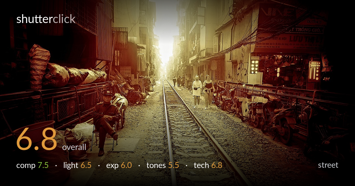
A strong sense of place anchors this frame — the railway running straight through a dense residential corridor is the kind of location that does compositional work on its own. The converging tracks pull the eye to the blown-out vanishing point, and the seated man on the left gives a human anchor against the layered clutter of motorbikes, sacks, and shopfronts. What most holds it back is the heavy, uniform sepia-red grade, which flattens the tonal separation and tips the whole image toward a single muddy hue. The highlight at the centre is fully clipped, and the foreground subject's expression reads only faintly.
The railway as a central leading line is the obvious strength here, and it works — the converging rails and sleepers march the eye straight to the bright vanishing point, with buildings layering inward on both sides. The seated man lower-left provides a counterweight and a human entry point, while the two walking figures add depth mid-frame. The near-symmetry of the corridor is effective for the subject. A slightly lower angle would have given the sleepers more prominence in the foreground, and the right edge crowds the motorbikes a touch.
The backlight pouring down the corridor creates atmosphere and the haze of an urban morning, but it's pushed past its useful limit — the centre is a featureless white-gold mass with no rendering of the buildings that should frame the far end. That glow does separate the walking figures as near-silhouettes, which helps. The side walls fall into deep shadow, and the seated man is lit only by ambient fill, leaving his face murky. Shooting slightly off the sun's axis would have tamed the blowout while keeping the mood.
Exposure is built around the bright vanishing point, and the central highlights are entirely clipped with no recoverable detail — a deliberate-looking choice for the glow, but it sacrifices the architecture at the corridor's end. The shadows on the left walls block up heavily, swallowing detail in the stacked goods. The midtones across the track and figures sit reasonably, but the dynamic range is stretched thin between those crushed shadows and the white core. Metering for the midtones with a graduated approach in post would recover more of both ends.
The dominant issue is the grade. A heavy sepia-to-red wash sits over everything, collapsing the natural colour variety of a busy street into one warm channel. It lends a nostalgic, cinematic mood, but at the cost of tonal separation — the red sacks, the brick, the motorbikes, and the gravel all read as variations of the same hue. The shadows carry a muddy warmth rather than a clean neutral. A lighter touch on the split-tone, restoring some blue in the shadows, would give the image far more depth and breathing room.
Focus appears reasonably placed through the central track region, with the sleepers and gravel holding detail into the middle distance. The seated man on the left is acceptably sharp, though the heavy grade and shadow make it hard to assess critically. Depth of field is wide enough to keep the corridor legible from foreground to the walking figures, appropriate for this kind of environmental street frame. There's no obvious motion blur — the figures are static enough that a moderate shutter handled them. The main technical limitation isn't capture but processing: aggressive contrast and toning have introduced banding and a loss of micro-detail in the brighter zones, and the clipped centre suggests the highlights weren't protected at capture. A slightly faster shutter wasn't needed here; the priority would have been exposing to preserve the far-end detail and applying a gentler grade to retain the natural texture of the scene.
What would elevate it
Tags
Shot something like this?
Expert photo critique, on demand — scored across six categories, EXIF-aware. Start with 3 free critiques, no credit card.
critique my photo — free