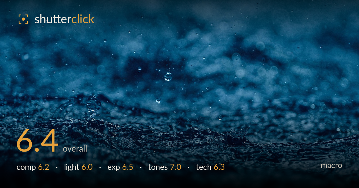
Rain on dark water
Photo by wal_172619

No EXIF metadata in this file
Technical analysis based on visual assessment only.
A moody, atmospheric study of rain-disturbed water that succeeds most on texture and colour, less on a clear focal anchor. The band of churning surface across the middle carries genuine energy, and the suspended droplet upper-centre offers a delicate accent. What holds it back is the absence of one crisp point of resolution — the sharpest zone sits in a broad, agitated band rather than on a single peak or droplet, so the eye wanders without landing. A tighter thin plane of focus on a rising crest or a frozen splash crown would give the frame the decisive detail macro work rewards.
The horizontal band of turbulent water bisecting the frame gives structure, and the suspended droplet upper-centre is a small but effective focal accent against the soft field above. The problem is that the roughly centred band of interest leaves large, undifferentiated soft zones top and bottom that add mood but little else. A stronger reading would place the sharpest crest on a third line and give the droplet more breathing room. As it stands the eye drifts across texture without settling on a clear anchor.
The light is soft and diffuse, reading as overcast or shaded, which suits the sombre mood but flattens the water's relief. Without a raking or directional source, the ripples and crests lack the specular highlights that would separate wet form from shadow and give the surface dimension. The scattered bright bokeh points in the background hint at stronger backlight just out of frame. A lower, more directional light skimming across the surface would carve out the ridges and lend the droplets sparkle.
Exposure is restrained and holds together well for the dark palette — shadows retain detail rather than blocking to pure black, and the brighter ripple highlights stay short of clipping. The overall low-key rendering appears deliberate and supports the atmosphere. The trade-off is that the darkest lower corners carry a little muddiness where separation is lost. A touch more midtone lift in the churning band, or a slightly brighter capture to be pulled down later, would open the water's structure without breaking the mood.
The monochromatic blue grade is the image's strongest asset — cohesive, cool, and evocative of cold rain, with pleasing gradation from deep navy to lighter steel in the crests. Contrast is judged for atmosphere rather than punch, which fits. The single-hue treatment risks feeling like a heavy filter, and a fraction of tonal variation — a warmer glint or a cleaner white in the brightest droplet — would keep it from reading as flat. Overall the colour discipline is deliberate and effective.
For macro, the critical question is where the plane of focus lands, and here it falls across a broad, agitated band of water rather than resolving on a single crisp element. The result is texture that reads as sharp-ish across a zone but never tack-sharp on one point — the suspended droplet, an obvious candidate for a focal anchor, sits slightly soft. The shallow depth of field and creamy bokeh are handled well and give the frame its atmosphere, and there's no obvious motion smear, suggesting a shutter fast enough to arrest the surface. Noise is controlled in the darker areas. The main gains would come from focus precision: nailing a single rising crest or a frozen splash crown on the focal plane, and closing the aperture a stop or two to hold a touch more of that peak in focus without sacrificing the soft field. A shorter working distance to fill the frame with one droplet's impact would also sharpen intent.
What would elevate it
Tags
Shot something like this?
Expert photo critique, on demand — scored across six categories, EXIF-aware. Start with 3 free critiques, no credit card.
critique my photo — free