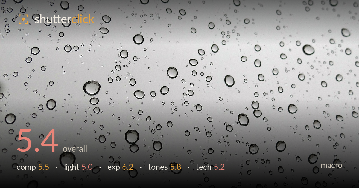
Raindrops on a window
Photo by 13delf2

No EXIF metadata in this file
Technical analysis based on visual assessment only.
The frame reads as an even field of water droplets on glass against a flat grey sky, and while the texture has quiet appeal, the image lacks a focal anchor to organise the eye. As a pattern study it works passively, but nothing rises out of the field — no standout droplet, no gradient of scale leading somewhere, no captured refraction to reward a close look. The soft, directionless light flattens the drops so they never sparkle or read as three-dimensional. A stronger version would either isolate a single hero droplet with a legible refracted image inside, or use raking light to carve depth into the pattern.
The distribution of droplets fills the frame evenly, which suits an abstract-pattern reading, but the composition offers no anchor — the eye wanders without settling. There is a loose sense of larger drops in the lower and central areas thinning toward the top, but that gradient isn't strong enough to function as structure. A macro that deliberately placed one dominant droplet off-centre, or arranged clear scale contrast, would give the field a point of entry and turn scattered texture into a composition.
The light is soft and completely directionless, coming from an overcast sky beyond the glass. That flatness is the weakest link: the droplets have thin dark rims but no internal highlight, no glint, no modelling that would make them read as rounded, wet, three-dimensional beads. Nothing sparkles. Raking side light, or a bright point source positioned to catch a specular highlight in each drop, would give the beads dimensionality and life, and could reveal refracted content inside the larger ones.
Exposure is handled reasonably. The grey background sits in the upper midtones without blowing out, and the dark droplet rims retain their edges, so the tonal range is used safely across a low-contrast scene. There is no meaningful clipping. The trade-off is that the whole image sits in a narrow band of light greys, which reads as slightly flat — but that is a tonal and lighting matter more than an exposure fault. The choice looks deliberate and controlled.
Essentially monochrome greys with a faint neutral cast. The tonal range is compressed into the lighter half, giving a soft, muted, overcast mood that fits the rain subject but limits impact. The droplet outlines provide the only real dark values, and they carry the image's contrast on their own. A touch more separation between the drops and the background, or a cleaner white balance decision toward true neutral, would strengthen the graphic quality without losing the quiet atmosphere.
Focus appears to fall on the plane of the glass, and the droplet edges are reasonably crisp where they should be, though not tack-sharp — the finest small drops look slightly soft, suggesting focus landed a hair off the droplet surface or diffraction and a small sensor are limiting resolution. Depth of field is broad enough to keep most of the field acceptably rendered, which is appropriate for a flat subject on a single plane. Noise is not an issue in these smooth greys. The core technical limitation is that macro of droplets rewards precise focus on the refractive content and specular highlights inside the beads, and here the drops read as empty outlines rather than tiny lenses. Focusing deliberately on the surface film of one larger droplet, and lighting to fill it with a refracted image, would demonstrate far more control. Tighter framing on fewer drops would also let the available sharpness carry more weight per bead.
What would elevate it
Tags
Shot something like this?
Expert photo critique, on demand — scored across six categories, EXIF-aware. Start with 3 free critiques, no credit card.
critique my photo — free