Rainy walk under a polka-dot umbrella
Photo by Engin_Akyurt

No EXIF metadata in this file
Technical analysis based on visual assessment only.
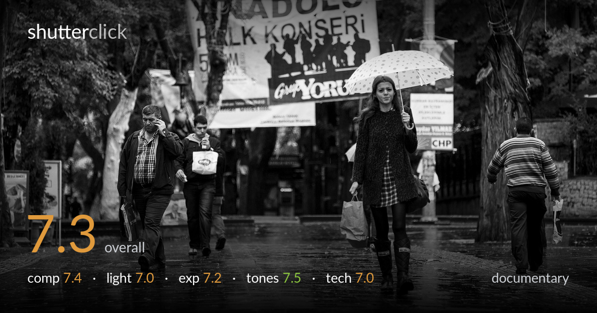
A well-observed rainy-street scene that earns its keep through the wet, reflective pavement and the umbrella-carrying woman as a clear focal anchor. The polka-dot umbrella reads strongly against the muted tones, and the layered cast of figures gives the frame documentary life. What most holds it back is the competition between subject and the busy banner overhead, which crowds the upper frame, and the man walking away on the right who pulls the eye out of the scene. Tightening the relationship between the woman and the surrounding figures, and dialling back the background clutter, would sharpen the narrative considerably.
The wet pavement converges and leads the eye upward into the frame, and the woman with the umbrella sits at a natural reading point left of centre. The staggered figures — phone-talking man, bag-carrying companion, departing man on the right — build documentary layering. The large banner dominates the upper third, however, drawing attention away from the people. The man exiting frame right leaks tension outward. A composition weighted more deliberately toward the woman, with the receding figure cropped or excluded, would consolidate the storytelling.
The flat, overcast rain light is honest to the scene and renders the wet stone with even, diffuse softness — no harsh shadows to distract from the figures. It suits documentary work and keeps faces readable. The trade-off is a lack of modelling: the light does little to sculpt the subject or separate her from the dark foliage behind. The brightest accents come from the umbrella and the reflective pavement, which do most of the lifting. A break of directional light would have added dimensionality.
Exposure is well managed for difficult flat conditions. The white umbrella and pale banner hold detail without blowing out, and the dark foreground figures and foliage retain shadow information rather than blocking up. The midtones sit comfortably, giving the wet pavement its luminous quality. There is a slight overall heaviness in the deep shadows of the tree line on the right, where detail falls away, but nothing that reads as a mistake. The histogram looks balanced and the rendering deliberate throughout.
The black-and-white conversion is the image's strongest tonal asset — the muted grey scale matches the rainy mood, and the umbrella's polka dots pop cleanly against it. Mid-tone gradation across the pavement is smooth and the reflections carry a soft sheen. Contrast is judged restrained, which fits the weather but leaves the overall feel a touch flat; a fraction more separation in the blacks would give the figures more presence. Highlight roll-off on the umbrella and banner is clean and controlled.
Focus appears to land on the woman with the umbrella, who is the sharpest element, while the background figures and banner sit slightly softer — an appropriate choice that aids subject isolation in a busy scene. Depth of field is moderate, enough to keep the principal subjects legible without collapsing the layered street into mush. There is no evidence of motion blur on the walking figures, suggesting a shutter speed quick enough to freeze the gentle pace, and noise is well controlled even in the shadowed tree line. The telephoto-leaning perspective compresses the figures pleasingly, stacking them along the receding pavement. The man on the right is rendered just as sharply as the subject, which technically is fine but compositionally competes. Overall execution is clean and competent; the main missed opportunity is not a slightly wider aperture to further soften the dominant banner, which would have eased its pull on the eye and reinforced the woman as the clear protagonist.
what would elevate it
tags
Shot something like this?
Expert photo critique, on demand — scored across six categories, EXIF-aware. Start with 3 free critiques, no credit card.
critique my photo — free