Recessed arches in old stone
Photo by Didgeman

No EXIF metadata in this file
Technical analysis based on visual assessment only.
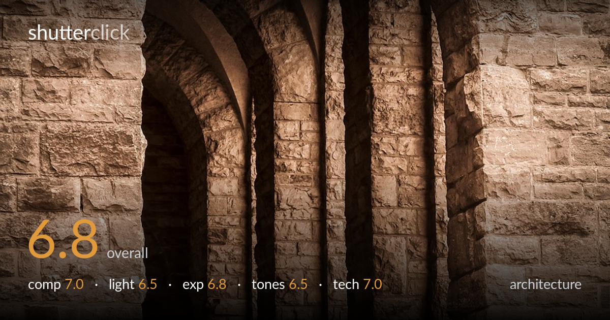
A strong, repeating arch motif anchors a near-symmetrical study of Romanesque stonework, and the recessed columns recede with genuine depth. What most holds it back is the geometry: the arch sits slightly off-centre and the verticals lean inward, so the symmetry the frame promises is never quite delivered. The sepia toning is pleasant but flattens the natural stone and risks looking applied rather than considered. The texture of the masonry is the real reward here — it reads clearly across the wall — and a careful verticals correction plus a cleaner tonal treatment would lift this from a competent record into a deliberate architectural portrait.
Centring the arched recess is a sound instinct for this kind of Romanesque facade, and the receding columns build real depth into the opening. The framing is let down by precision, though: the arch reads marginally left of centre and the stone wall is given unequal weight on either side. The foreground steps add a useful base, but they crowd the bottom edge. A touch more breathing room at the apex and tighter left-right balance would make the symmetry feel intentional rather than approximate.
Soft, diffuse light suits the stone, rendering the masonry texture evenly without harsh blown highlights. The directional shadow falling into the recess gives the columns welcome separation and a sense of volume. What's missing is any raking light to carve the surface — the wall reads a little flat, and the deepest recesses go murky without enough modelling to hold interest. Side light late in the day would have pulled far more dimensionality from the carved arches and the coursed stone.
Exposure is handled competently for a high-texture, mid-key subject. Highlights on the upper stonework are held without clipping, and the bright foreground steps retain detail. The deepest shadow in the left recess blocks up to near-black, losing some of the structure there, though that loss reads as a reasonable trade for keeping the stone faces clean. The overall midtone placement is a touch dark, which suits the mood but leaves the lower-left columns harder to read than they need to be.
The sepia treatment lends a period, archival feel that fits the architecture, but it also overrides the stone's natural variation and pushes everything toward a single warm hue. Tonal separation between the lit faces and the shadowed recesses is decent, yet the mid-tones feel compressed and slightly muddy in the columns. Contrast is moderate but could carry more punch. A cleaner monochrome conversion, or a more restrained warm tone, would preserve the textural range the toning currently flattens.
Focus is accurate across the stone faces, and the masonry texture is resolved cleanly from the arch down to the foreground steps, suggesting an aperture chosen to hold depth across the whole plane — appropriate for this subject. There's no obvious motion blur or visible noise, pointing to a stable platform and a sensible ISO. The most pressing technical issue is perspective: the verticals converge inward and the structure leans, indicating the camera was angled upward without correction. For architecture this matters, and the inward lean undermines the symmetry the composition relies on. A perspective-control adjustment in post, or a tripod with a shifted or level approach on a reshoot, would straighten the columns and let the arch sit square. The recessed shadows also lose some detail that a slightly higher dynamic-range capture or a gentle shadow lift would recover. Overall the execution is solid; the geometry is where it falls short of architectural rigour.
What would elevate it
Tags
Shot something like this?
Expert photo critique, on demand — scored across six categories, EXIF-aware. Start with 3 free critiques, no credit card.
critique my photo — free