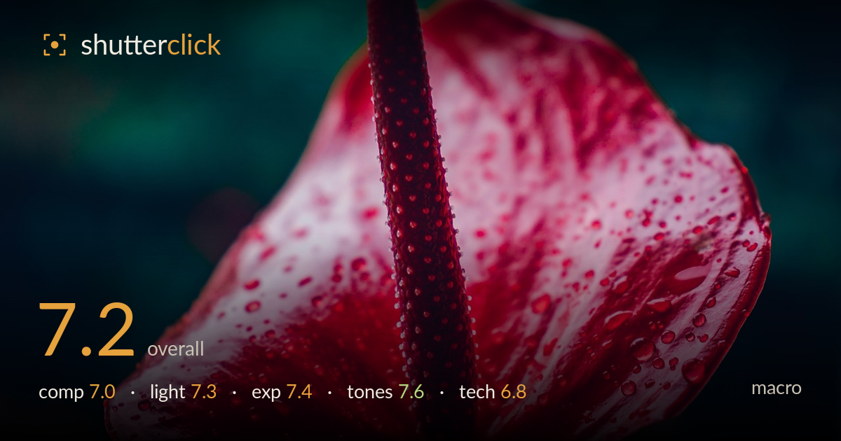
Red anthurium with dewdrops
Photo by Nilanka_Sampath

No EXIF metadata in this file
Technical analysis based on visual assessment only.
A striking red anthurium rendered with rich colour and a clean, dark backdrop that isolates the subject cleanly. The spadix reads as a strong vertical anchor and the water droplets add texture and life. What most holds it back is focus placement: the sharpest plane sits on the mid-spadix and near petal, while much of the spathe drifts soft, leaving the eye without a fully resolved detail region. The composition crowds the frame edges, clipping petal tips. A touch more depth of field and breathing room would lift a well-seen subject into something more precisely realised.
The diagonal spadix cutting through the frame gives strong structure, and the dark surround isolates the bloom well. Placing the tip of the spadix near the top and the flower filling the lower two-thirds creates good weight. However, the petals clip against both left and right edges, cramping the form and denying it room to breathe. The lower petal edge also runs close to the frame bottom. A slightly wider framing, or repositioning so the spathe's outline stays contained, would let the shape read more completely.
Soft, directional light models the spathe's curves and picks out the droplets with small specular highlights, giving the surface a tactile wet sheen. The falloff into shadow at the petal edges adds dimension and helps separate the flower from the near-black background. The light is a touch flat across the central spathe, muting some of the ridged texture on the spadix. A more raking angle would carve deeper relief into the bumpy spadix surface and give the droplets stronger, more sculptural catchlights.
Exposure is well judged for the mood. The deep background sits near black without blocking up into a total void, and the red spathe retains detail across most of its surface. A few of the brightest droplet highlights and the palest petal streaks edge toward clipping, but nothing distracting. Shadow detail in the darker petal folds holds acceptably. The overall placement keeps the saturated red from posterising, which is the main risk with a subject this dominant in one hue. A restrained, deliberate result.
The red-against-teal-black palette is the image's strongest asset, a bold complementary pairing that gives real punch. The reds carry good gradation from deep crimson in the spadix to lighter pinks on the spathe, avoiding the flat clump that heavy saturation often causes. White balance leans cool in the background, which flatters the warm subject. Watch the deepest reds in the spadix, where saturation approaches the limit of tonal separation. A slight pull on red saturation would recover a touch more surface detail there.
Focus is the central technical concern here. The sharpest plane falls across the mid-section of the spadix and the near petal, where the droplets are crisply resolved, but the depth of field is shallow enough that the upper spadix tip, the left petal, and much of the outer spathe drift into softness. For macro, where detail and texture are the point, a narrower aperture or a focus-stacked sequence would hold the key surfaces sharp from the spadix tip through the petal edges. The droplet rendering that is in focus is genuinely good, showing fine specular detail and clean edges, which suggests capable optics and a steady technique. Noise is well controlled and the background bokeh is smooth and unobtrusive. The trade-off between subject isolation and detail coverage tilted slightly too far toward isolation. Stopping down two stops, or bracketing focus and blending, would preserve the clean background separation while resolving far more of the flower's texture.
What would elevate it
Tags
Shot something like this?
Expert photo critique, on demand — scored across six categories, EXIF-aware. Start with 3 free critiques, no credit card.
critique my photo — free