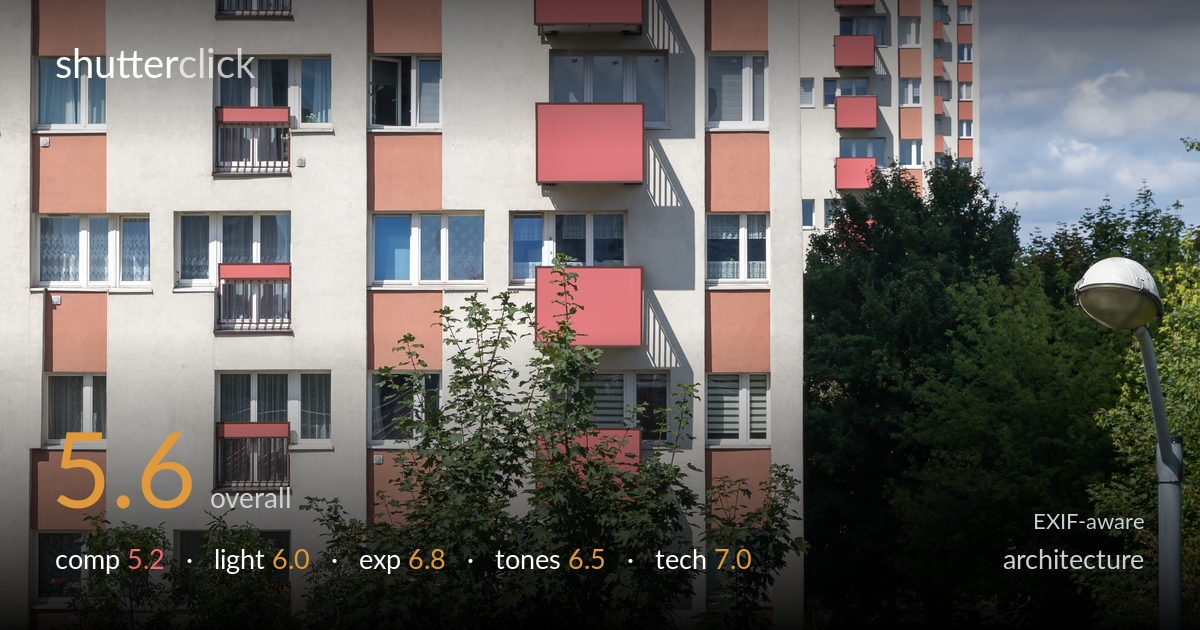
Red balcony apartment block
Photo by Matti Blume

| Focal length | 59 mm |
| Aperture | f / 9.0 |
| Shutter | 1/500 s |
| ISO | ISO 100 |
| Exp. comp. | -1.0 EV |
| Shot at | 09:01 · Aug 6, 2024 |
The repeating salmon-red balconies against grey concrete give this image a strong graphic spine, but the foreground foliage undercuts it badly — climbing trees obscure the lower third of the main block and crowd the bottom of the frame without adding intent. The receding diagonal of balconies and the second tower behind create real depth, yet the composition reads as caught between a tidy facade study and an environmental view, committing to neither. Verticals hold reasonably well. Tightening the relationship between building and greenery, and choosing one clear subject, would lift this from documentation toward a considered architectural statement.
The rhythm of the protruding red balconies stepping down the facade is the strongest element, and the secondary tower at right adds layering and depth. But the foreground trees are a real problem — they swallow the building's base and the bottom edge becomes a tangle of branches that competes rather than frames. The lamp post at right sits awkwardly, neither anchoring nor balancing. The frame can't decide between a flat facade study and a wider context shot. A cleaner viewpoint isolating the balcony pattern, or a deliberate use of the foliage, would resolve the tension.
Bright midday sun delivers flat, top-heavy light that does the facade few favours — the concrete reads as a uniform grey wall with little modelling. The side-raking shadows under each balcony do add some welcome dimensionality and reveal the stepped geometry, which is the one place the light works. The sky is pleasant with broken cloud but the overall hard, high-sun quality flattens texture across the building. Light angled lower, from a morning or late-afternoon sun, would rake across the surface and bring out the relief of the balconies far more convincingly.
The -1.0 EV compensation was a sensible call here, protecting the bright sky and the pale concrete from clipping. Highlights in the white window frames and clouds hold detail, and the shadowed window recesses retain information without blocking up. The overall brightness sits a touch dark on the building face, a side effect of metering for the sky, but nothing is lost that a raw lift couldn't recover. Histogram usage is solid for a high-contrast daylight scene. A graduated approach balancing the bright sky against the facade would have allowed a slightly brighter mid-tone on the concrete.
The salmon-pink balconies against neutral grey concrete and green foliage form a coherent, slightly muted palette that suits the subject. White balance is accurate — the concrete reads neutral and the sky blue is believable. Contrast is moderate and the greens are natural rather than oversaturated. The reds could carry a touch more punch to make the balcony rhythm sing, and the overall tonal range feels a little flat in the building mid-tones from the dark exposure. Nothing jars, but the grade plays it safe where the colour relationship invited a bolder treatment.
Settings are well matched to the subject. At f/9 the depth of field is ample for a frontal facade shot, holding both the near building and the second tower acceptably sharp, and ISO 100 keeps the image clean with no visible noise. The 1/500 shutter is far faster than a static building demands but costs nothing here. The 59mm focal length on full frame is a reasonable choice that keeps perspective distortion modest, and verticals stay largely upright without obvious keystoning — good discipline for architecture. Focus appears accurate across the facade. The one technical limitation is depth-of-field management interacting with composition: the foreground foliage, also rendered sharp at f/9, competes with the building rather than falling away. A longer lens from further back would have compressed the scene, isolated the balcony pattern, and reduced the prominence of the trees, making better use of the otherwise sound exposure triangle. Execution is clean; the choices around framing distance matter more than any setting.
What would elevate it
Tags
Shot something like this?
Expert photo critique, on demand — scored across six categories, EXIF-aware. Start with 3 free critiques, no credit card.
critique my photo — free