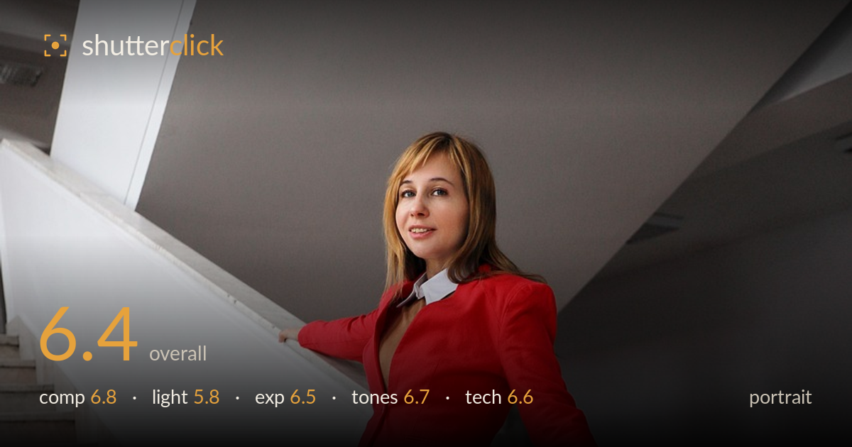
Red blazer on the staircase
Photo by Sunriseforever

No EXIF metadata in this file
Technical analysis based on visual assessment only.
A clean, confident full-length fashion portrait carried largely by the diagonal of the staircase and the strong red-against-white colour block. The pose reads relaxed and the subject engages the camera with an easy expression. What most holds the frame back is the lighting: flat, diffuse indoor ambient light that leaves the face without modelling or a catchlight, and the composition sits the subject slightly high with generous ceiling above. The staircase diagonal is the strongest structural asset here, and the wardrobe styling is well coordinated. Directional light and a tighter frame would lift this from a solid catalogue image to a striking one.
The descending staircase forms a strong diagonal that anchors the subject and gives the frame movement, and the leaning pose along the banister uses that line well. The red blazer against the white wall isolates the figure cleanly. However, the top third carries a lot of dead ceiling and shadowed overhang that pulls weight away from the subject, and the figure sits high in the frame. A lower vantage or reframing to reduce ceiling and follow the stair line further would tighten the balance considerably.
The light is soft, even indoor ambient with no clear direction, which keeps the exposure manageable but leaves the face flat and without modelling. There is no catchlight in the eyes and little separation between the planes of the face, so the portrait lacks the dimensionality good light provides. The diffuse quality does render the marble and wall smoothly. A window as a directional key, or a reflector to add a catchlight and shape the cheekbones, would bring the subject to life.
Exposure is well judged overall. The bright white walls and pale marble are held below clipping while retaining texture, and the subject is exposed correctly with skin tones sitting at a natural brightness. Shadow areas under the overhang and stair treads keep detail rather than blocking up. The high-key environment is handled without the figure being underexposed against it, which is the common trap here. Midtones sit comfortably. Nothing significant is lost at either end of the range.
White balance is clean and neutral, with the whites reading true and skin tones natural without a colour cast. The red blazer is saturated and punchy without bleeding, giving the frame its focal energy against the muted greys and whites. The grey plaid and tights harmonise with the marble palette. Contrast is on the gentle side, in keeping with the soft light, and the overall grade is restrained and tasteful. A touch more midtone contrast would add snap without harming the airy feel.
Focus appears accurate on the face and the eyes read sharp at viewing size, with the wardrobe detail — the plaid weave, the dotted tights, the shoe strap — well resolved, suggesting a competent aperture choice that keeps the full-length figure in acceptable focus. Depth of field looks moderate; the background wall and stairs stay legible rather than melting away, which suits an environmental fashion portrait but offers little subject-background separation beyond the colour contrast. There is no visible motion blur, and noise is not an issue in this well-lit interior. The framing is level and verticals hold reasonably true. The main technical lever left unpulled is separation and light shaping: a wider aperture or longer focal length would soften the busy stair treads and lift the subject further, and directional light would add the modelling the flat capture lacks. Execution is clean and reliable throughout; the ceiling headroom is the one framing decision worth reconsidering.
What would elevate it
Tags
Shot something like this?
Expert photo critique, on demand — scored across six categories, EXIF-aware. Start with 3 free critiques, no credit card.
critique my photo — free