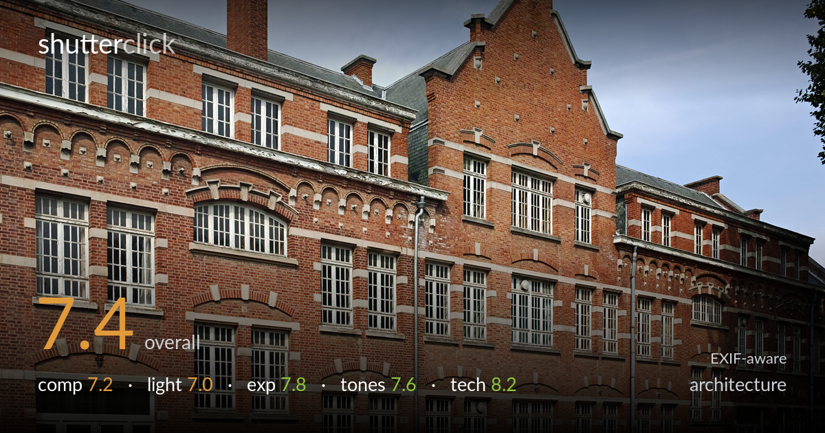
Red brick facade
Photo by Velvet

| Focal length | 19 mm |
| Aperture | f / 8.0 |
| Shutter | 1/250 s |
| ISO | ISO 100 |
| Exp. comp. | 0.0 EV |
| Shot at | 13:13 · Sep 19, 2021 |
A clean, well-resolved architectural record of a richly detailed brick facade, carried by excellent rendering of the brickwork, stone banding, and decorative gables. The three-quarter angle gives depth and shows the building's recession down the street, but it also introduces converging verticals that read as a slight lean rather than a deliberate perspective statement. The composition is competent but could be more decisive — the receding wing on the right tapers into clutter. Light is flat sidelight that documents faithfully without dramatising the relief. As a survey image it is strong; as a more expressive architectural statement it leaves intentionality on the table.
The oblique angle is a sensible choice for conveying the building's length and the rhythm of bays and gables, and the stepped Flemish gable anchors the frame well at upper centre-right. The foreground street and shrubs ground the structure. Less successful is the right side, where the receding wing compresses into busy detail and the frame edge clips it awkwardly. The downpipe bisects the central bay distractingly. A position slightly further back, or a cleaner head-on treatment of the gable, would resolve the tension between documenting length and presenting a balanced principal subject.
Soft, slightly hazy daylight from the left provides even, shadow-light illumination that documents the facade fairly but does little to sculpt the brick relief, corbelling, or the recessed window reveals. The decorative arched brickwork and dentil courses would gain depth under a lower, more raking sun. Highlights on the pale stone bands are held without blowing out, and the overall flatness keeps the whole facade legible — appropriate for a record shot. The trade-off is that texture and three-dimensionality stay muted; the building reads as catalogued rather than lit.
Exposure is well judged across a wide brightness range. The white window frames and pale stone trim retain detail without clipping, while the shadowed reveals and the slate roof hold tonal information. The sky is clean and gradated with no banding. ISO 100 keeps the file clean throughout. Midtones in the brick sit at a natural level, neither muddy nor washed out. There is no sign of accidental under- or over-exposure; the histogram appears to use the available range fully and deliberately. A faithful, technically secure exposure for the conditions.
Colour rendering is a strength — the Foveon sensor delivers warm, saturated brick reds with good separation between the orange-red field and the cooler grey-white stone banding. White balance is accurate and the blue sky reads naturally without oversaturation. Contrast is moderate and suited to the flat light, preserving detail in both the masonry and the slate. The greens of the foreground shrubs sit a touch dull but do not distract. Tonal gradation across the brickwork is smooth and the image avoids any heavy-handed grading. Honest, pleasing colour.
The Sigma dp1 Quattro at f/8 is well within the lens's sharp aperture range, and the result shows it — fine mortar lines, brick texture, and window mullions are crisply resolved across the frame with the Foveon sensor's characteristic micro-detail. ISO 100 and 1/250s are ideal for a static subject in daylight, yielding a clean, noise-free file with deep tonal information. The 19mm (roughly 28mm equivalent) is a reasonable focal length for the working distance, though a touch wide, contributing to the noticeable convergence of verticals on the left and right. Focus is accurate and depth of field is more than adequate for the entire facade. The main technical shortfall is uncorrected keystoning: the verticals lean inward, which a tilt-shift lens or, more practically, perspective correction in post would resolve. For strict architectural work the converging parallels are the one execution detail holding an otherwise excellent capture back from a higher mark.
What would elevate it
Tags
Shot something like this?
Expert photo critique, on demand — scored across six categories, EXIF-aware. Start with 3 free critiques, no credit card.
critique my photo — free