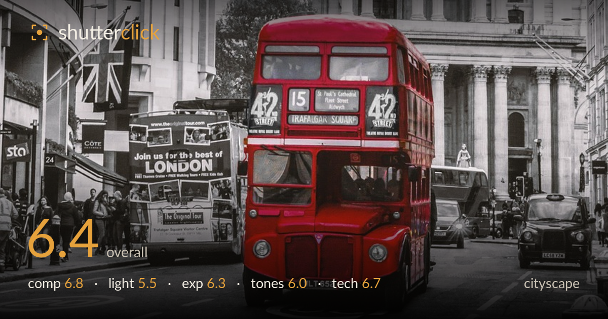
Red bus below st paul's
Photo by TeeFarm

No EXIF metadata in this file
Technical analysis based on visual assessment only.
The selective-colour treatment — a red Routemaster against a desaturated St Paul's — is an effective, if familiar, London postcard device, and the bus is well placed to anchor the frame against the cathedral's grandeur. What holds it back most is the flat, overcast light: the dome and portico read as grey and dimensional-flat, with no modelling to bring out the stonework. The composition is solid but slightly crowded, the sky is a featureless white, and the selective-colour effect leaks onto the second bus. A stronger sky and more directional light would lift this from tourist snapshot toward something more considered.
The bus sits low-centre, forming a clear focal anchor beneath the towering cathedral — a workable pyramid of interest with the dome as apex. The framing buildings on both sides funnel the eye inward, and the Union Jack adds a supporting note. The lower third grows busy, though, with a second bus, taxis and pedestrians competing for attention and cluttering the base. The cathedral is cropped tightly at the top, clipping the cross's breathing room. A touch more headroom and a cleaner street level would let the main subject read with more authority.
Flat, overcast light is the weakest element here. The heavy cloud cover erases directionality, leaving the dome, columns and pediment carvings rendered in low-contrast grey with little sense of depth or texture. Overcast light suits even-toned scenes, but classical architecture of this kind wants raking, directional light to model its reliefs and mouldings. The white sky offers no gradient or drama to frame the silhouette. Shooting in low, side-lit golden hour would carve out the stonework and give the whole scene a dimensionality it currently lacks.
Exposure is generally competent — the red bus retains detail in its bodywork and the shadowed shopfronts on the left hold information. The main concern is the sky, which is pushed to near-pure white and clips any cloud detail that might have existed, leaving an empty upper zone. Midtones across the stonework are placed reasonably, though the whole frame leans slightly toward the muddy middle. Pulling back exposure a third of a stop and recovering highlights in post would restore some tonal separation in the brightest arems without darkening the subject.
The selective-colour grade is the defining choice: a saturated red bus against monochrome surroundings. It works as a device but is executed imprecisely — the red bleeds onto the second bus behind, weakening the isolation effect that makes this technique land. The monochrome portions are a touch flat, with greys clustering in the middle and little deep shadow to anchor them. A cleaner mask around the primary bus, plus a slightly stronger black point in the desaturated areas, would sharpen both the colour pop and the overall contrast.
Focus sits well on the bus, which is the intended subject, and the cathedral behind holds acceptable sharpness, suggesting a mid-range aperture that kept depth reasonable across the scene. There's no obvious motion blur despite the moving traffic, so the shutter was quick enough for the situation. Noise is well controlled, consistent with good light and a low ISO. The lens choice compresses the street pleasingly, stacking the bus against the dome. The main technical limitation is the selective-colour processing rather than capture: the colour mask is loose, catching the red on the rear bus and a few stray edges. Verticals on the flanking buildings show mild convergence but nothing severe for a street-level cityscape. Overall the capture is clean and competent; refinement in post — a tighter selective-colour selection and highlight recovery — would do more for this image than any change at the moment of shooting.
What would elevate it
Tags
Shot something like this?
Expert photo critique, on demand — scored across six categories, EXIF-aware. Start with 3 free critiques, no credit card.
critique my photo — free